Carousel, a sliding component used in the top page and navigation of a website, is implemented in the Next.js App Router. This time, Embra Carousel will be used.
Next.js + Embla Carousel
2025-07-09
Project Creation
First, create a Next.js project.
sh
Create a src/styles folder for the style files and move them to the folder where globals.css was created. Then rewrite the import of the src/app/layout.tsx file that references this file as follows
src/app/layout.tsx
Please confirm that the sample page is displayed after the change.
sh
Now you are ready to go.
Installing Embla Carousel
We will use the Embla Carousel package, a package that can be used not only with React but also with the so-called bare-bones environment of Vanilla. This package is very lightweight and has been used extensively.
First, let's proceed to the point where a simple sample works.
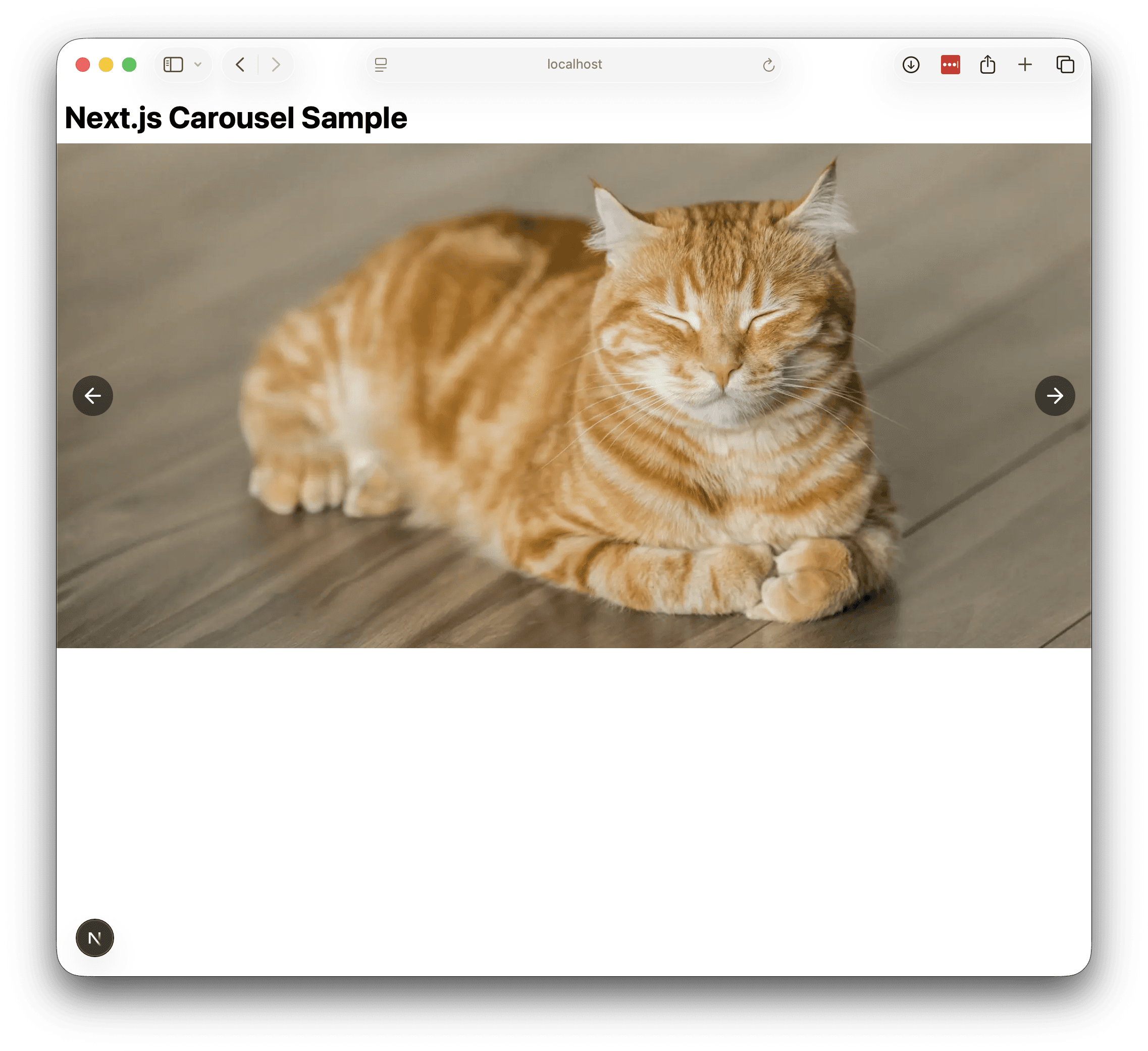
Prepare images
Prepare an image to show the sample in action. In this case, we used unsplush to add three images under public. Here is a picture of a cat.

Installing packages
We will install the Embla Carousel packages. This time, we will install two packages in order to add autoplay functionality.
sh
Embla Carousel is now available.
Create Components
Using the sample code on the Embla Carousel site as a reference, we have created the following component, which will act as a carousel using the image copied to public.
src/components/Carousel.tsx
Create a file src/styles/carousel.css as the style sheet used on this page and style it as follows
src/styles/carousel.css
To make this style available, we will load it in the globals.css file, but we will take this opportunity to remove the code provided in the sample.
src/styles/globals.css
Use the carousel
Ready to use. First, use the component on the top page.
src/app/page.tsx
In addition, remove the sample code from the layout.tsx file.
src/app/layout.tsx
Now you are ready to go. Execution.
sh
The image will change periodically on a slide.

The carousel has been implemented.
Add button
Currently, it only switches automatically, but we will add more elaborate left and right buttons and change it to switch back and forth when clicked.
At this for sample, use Lucide Icons for icons.
Install the package.
sh
Now the icon is available, rewrite the Carousel component as follows
src/components/Carousel.tsx
Then make the following changes to the style sheet.
src/styles/carousel.css
After the change, the button will be added as follows
Summary
In this case, we used the Embla Carousel package to create a carousel component. It is possible to implement a carousel by displaying thumbnails and switching between them when clicked. For more details, please refer to the official website of Embla Carousel, or see the various tips.
Based on this sample, it is possible to implement a page transition when the displayed slide is clicked, or to link to carousel data managed by the CMS, so it is important to understand this base first.