This document introduces how to use Storybook by adding it to a Next.js project. You can create the UI of components in parallel with the program development.
Next.js + Storybook
2025-07-10|2025-11-16
Creating projects
The first step is to create a Next.js project, followed by installing Storybook.
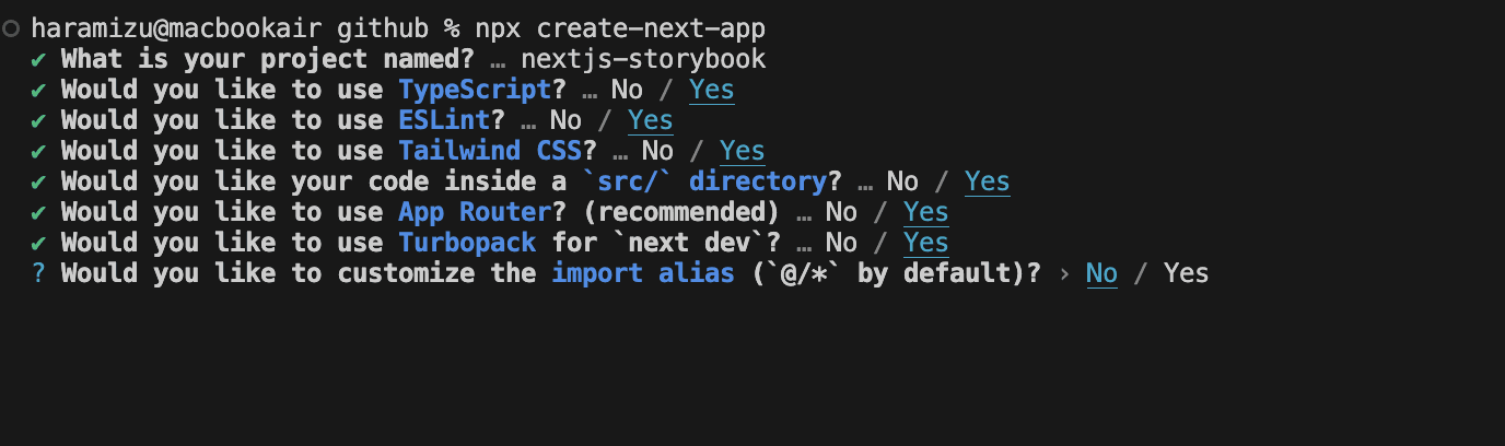
Creating a Next.js project
Create a Next.js + Tailwind CSS project as a project creation.
sh
Note: Regarding postcss.config.mjs, as Next.js has been updated, the steps below are no longer necessary. Please skip it and go to Install Storybook.
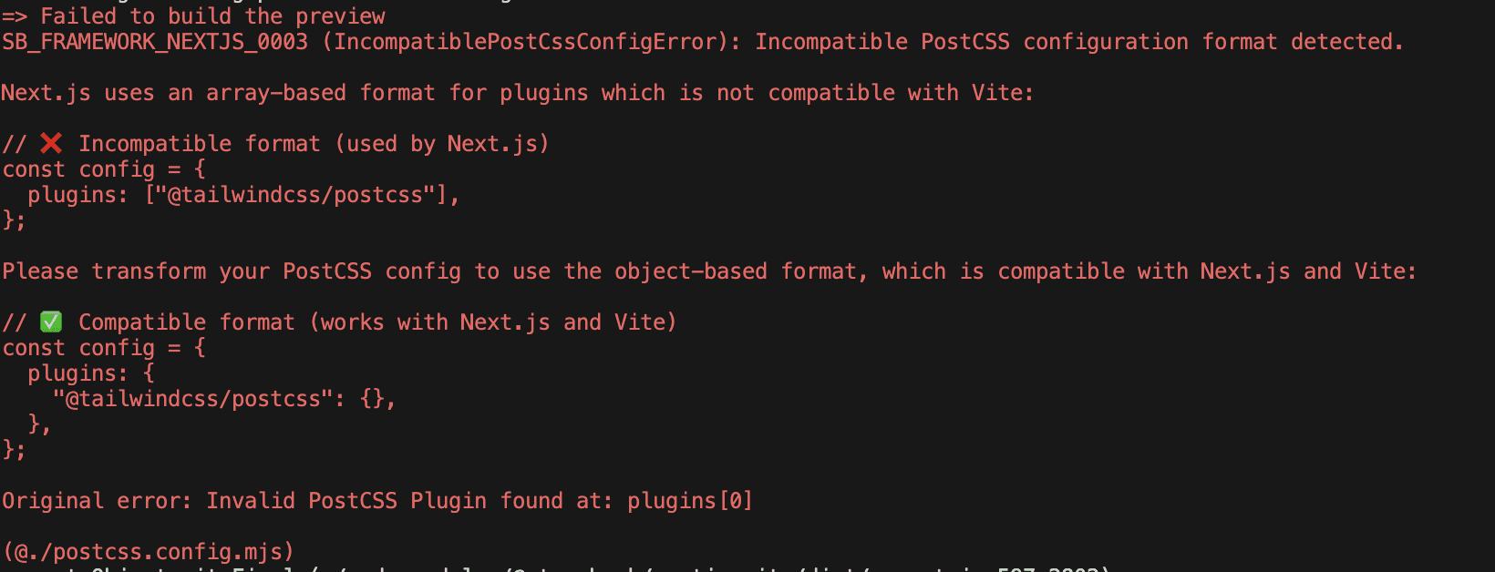
Note that the postcss.config.mjs setting displayed in the standard template will show an error when installing Storybook.The file as created is as follows.
postcss.config.mjs
Rewrite this as follows.
postcss.config.mjs
The above changes will be displayed as error messages if the installation is run as is.Make the changes beforehand.
Install Storybook
As for the installation procedure, for Next.js, follow the React procedure on the official website.
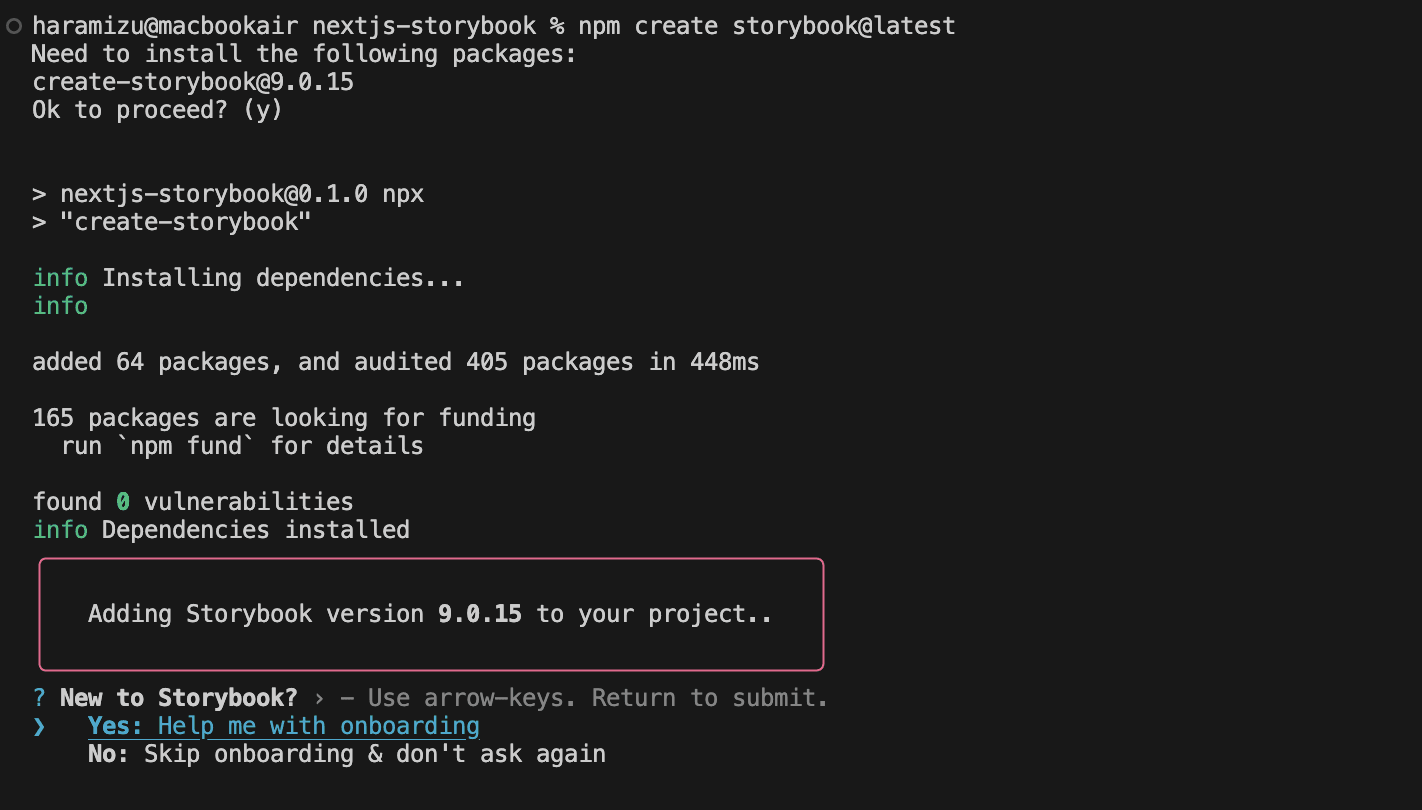
Proceed with the installation using the following command.
sh
The installer displays confirmation that a new installation is to be performed.
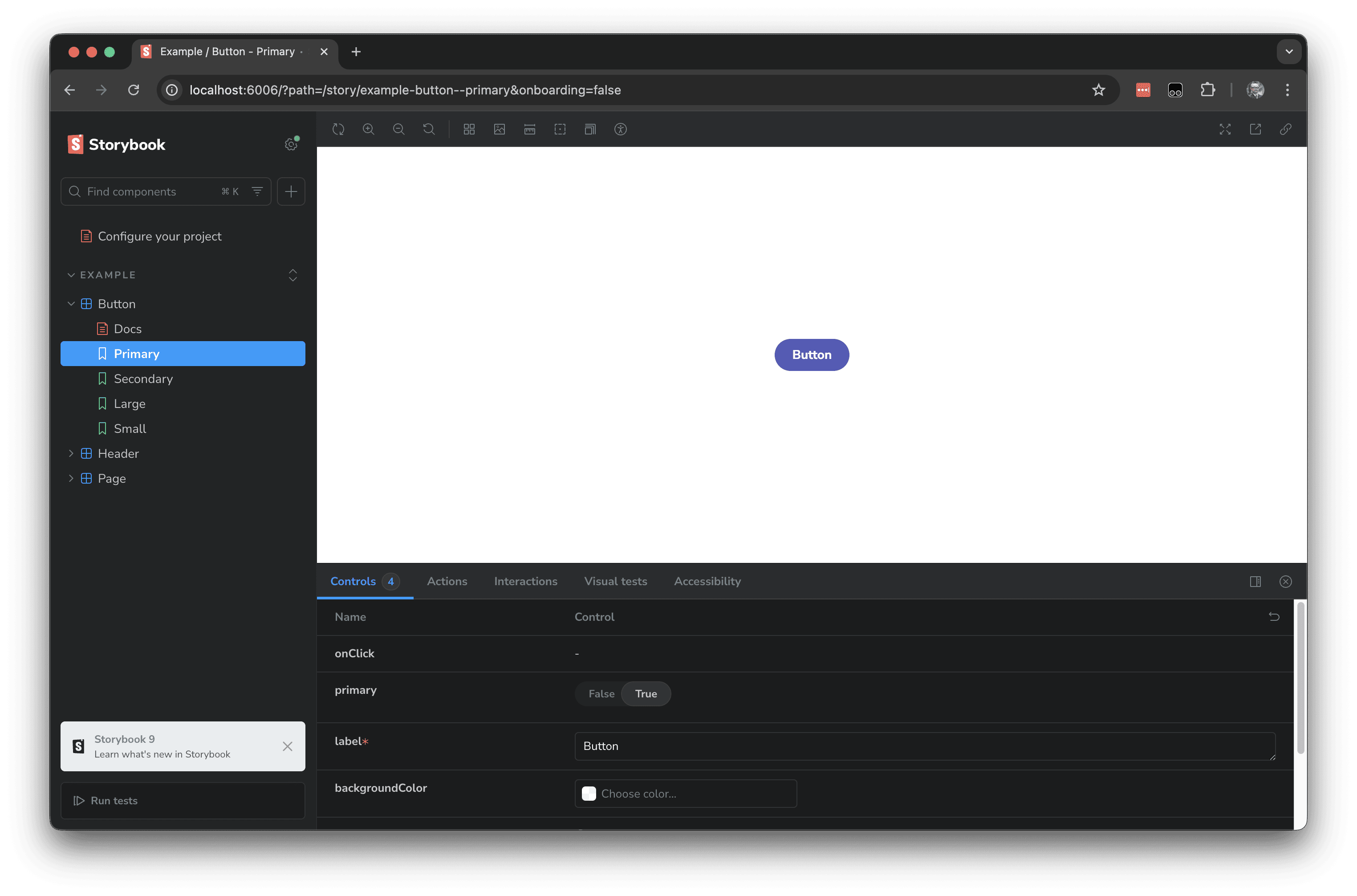
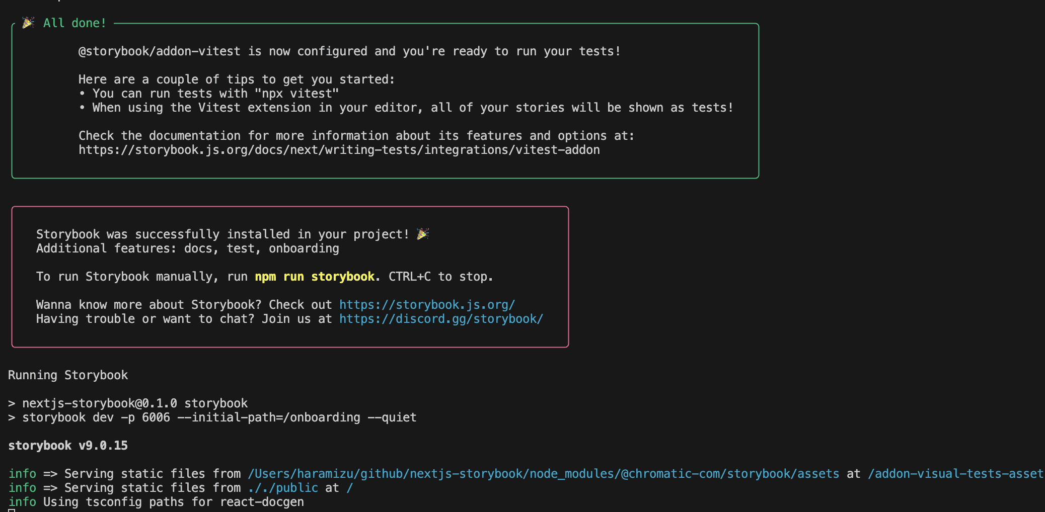
After a short time, the Storybook screen appears.
The terminal screen after the installation is complete is shown below.
Check the file.
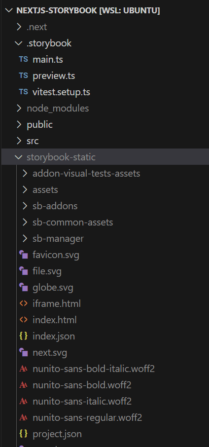
We will review the changes made to Next.js when the Storybook is added to Next.js. The changes can be seen in Visual Studio Code as follows.
The changes alone can be picked up as follows.
- .storybook — storybook layout files
- package.json — install storybook package
- vitest.config.ts — config for Vitest
- vitest.shms.d.ts — global type definitions for Vitest
If you run npm run build to check the operation after installation, you will receive the following error.
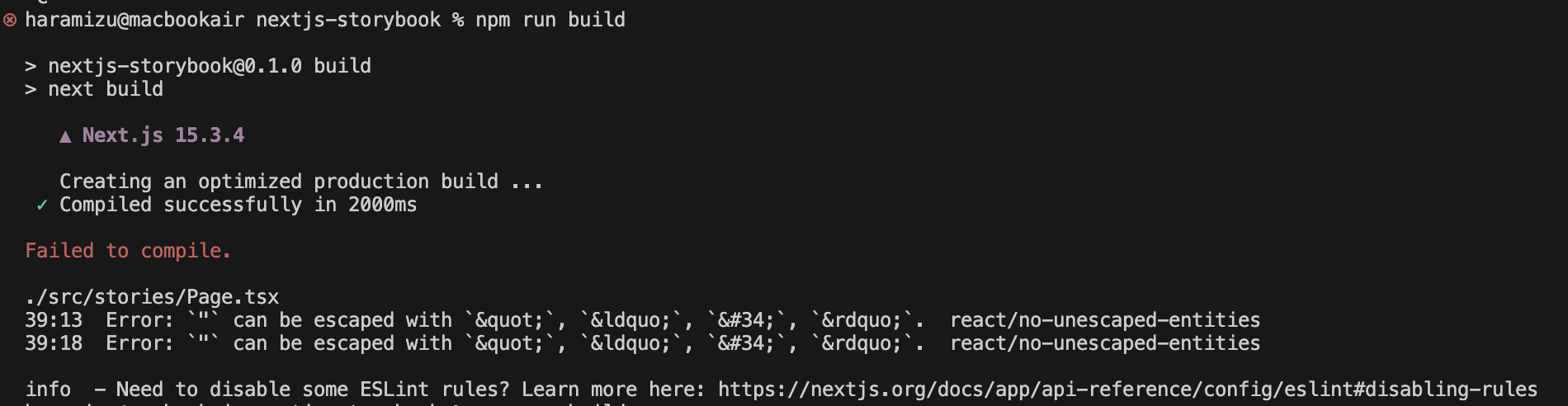
This is an ESlint error in the file src/stories/Page.tsx, line 43, which contains the description "args". Rewrite as follows.
html
The build can now be performed.
Checking the operation of Storybook
In the current project, Next.js and Storybook coexist by executing commands.First, the following command is used to start Next.js.
sh
This will start Next.js at http://localhost:3000.
You can also start Storybook with the following command.
sh
This will start Storybook on a different port from http://localhost:6006/ and Next.js.This means that the two programmes will run in the same project.
Components created in Storybook can also be built and deployed as static sites.In this case, use the following command.
sh
The build is performed as follows.
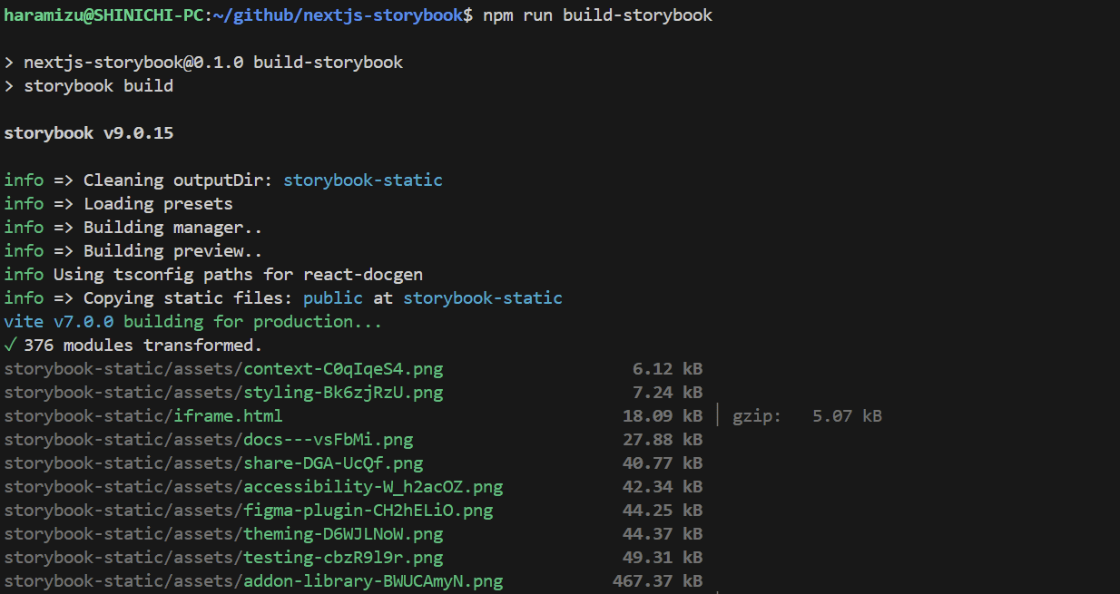
The site is then deployed on storybook-static.
Using Tailwind CSS
At the stage of setting up the Storybook, the Tailwind CSS used in Next.js is not referenced.Therefore, we will change the Storybook settings to refer to Tailwind CSS.
Organising style sheets
Organise style sheet files.
- The existing project is the initial state of Next.js, so the files used by Tailwind CSS are applied in src/app/globals.css.Move this to src/styles/globals.css.
- Move the css files contained in the src/stories folder to src/styles as above.
- Load the moved stylesheet with the globals.css import.
src/styles/globals.css
Inside the styles folder you will find the following.
- button.css
- globals.css
- header.css
- page.css
The path to the stylesheet loaded in the file src/app/layout.tsx will also change, so make the following changes.
src/app/layout.tsx
To set up the style sheet so that the storybook can refer to it, the following files should also be changed to load the style sheet.
.storybook/preview.ts
The style sheet has now been adjusted.
Creating the components folder
Make the following changes so that you can use the components provided in the storybook as components to be used in Next.js.
- Delete src/stories/Configure.mdx and src/stories/assets
- Change the folder src/stories to the folder src/components.
- Delete lines of css loaded in src/components/Button.tsx, src/components/Header.tsx and src/components/Page.tsx
Then proceed with the changes so that Storybook recognises the above components.First, in .storybook/main.ts, change the settings so that the files are placed under the folder of the components you have created this time.
.storybook/main.ts
With the above changes, it is now possible to define a stories.ts file for components created in Next.js and display the components.
Component updates
As this Next.js project is set as App Router, Button.tsx and Page.tsx have additional processing on the client side, so the following one line needs to be added.
tsx
The component is now available in Next.js.
However, if you include this code, an error will be displayed when you execute build in storybook. The screen will look like the one below.
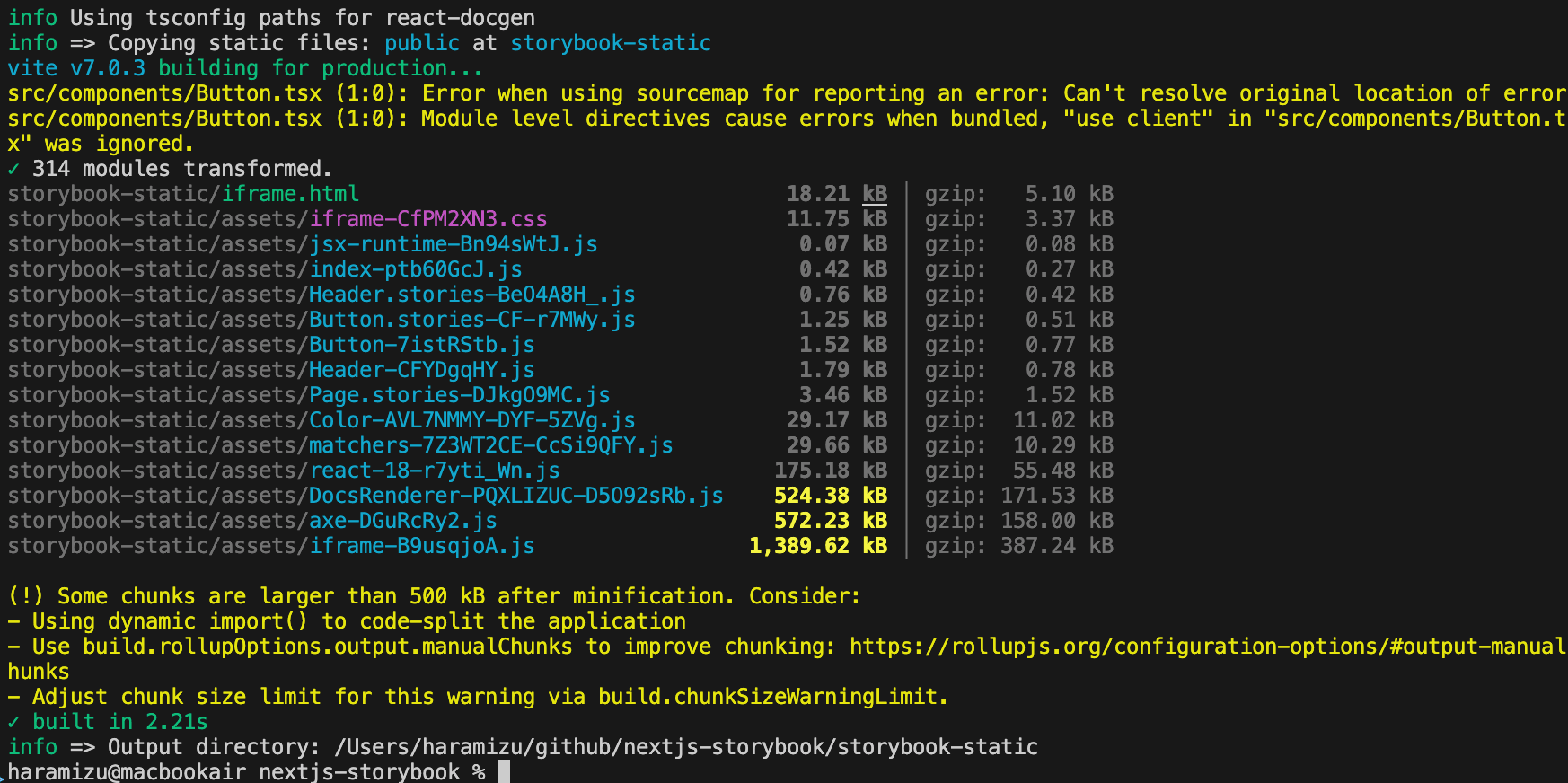
The warning in the first half indicates that adding "use client" is the problem. The warning in the second half indicates that the size is increasing.
To avoid this, add the following code to the .storybook/main.ts file.
.storybook/main.ts
This will prevent the warning from appearing.
Storybook file structure
Finally, the role of the stories.tsx file as defined in Storybook.First, the definition file src/components/Button.stories.ts for Button.tsx is introduced in order of functionality from the top.
src/components/Button.stories.ts
The above code defines that it is stories.ts for Button.tsx in the same folder.
src/components/Button.stories.ts
This defines what is displayed on the Storybook screen.
- Show as Button in the Example group
- Centred in layout.
- Automatically create Doc files using autodocs
- Defining variables for use in components with argTypes.
- Implementation of onClick
When setting the definition of the data to be used in the component, this can be handled by increasing the argTypes entry.The following items at the end allow you to set the values for when the display is to be displayed and samples can be displayed.
src/components/Button.stories.ts
Addition of dark mode.
Storybook enables the switching between light and dark modes to be changed on-screen.This makes it much easier to create and check components.
Setting: Storybook
The first step is to set up the Storybook side.
sh
Then add the installed Addon to the Storybook configuration file.
.storybook/main.ts
Add the relevant code withThemeByClassName so that when Storybook displays it, it switches modes by specifying the Class, as in Next.js.
.storybook/preview.ts
Setting: Tailwind CSS
This is easy to set up, simply add the following line to the globals.css file and dark mode will work.
src/styles/globals.css
Add the Card component.
Create a Card component for dark mode.First, create the Card component as follows.
As we want to use images as assets in the Card component, we add the asset Interface first.
src/types/asset.ts
This Asset definition is used to set the data items to be handled by the Card.This time, top and left are prepared for the position of the image in the Card.
src/components/Card.tsx
The style sheet for this card is created as follows.
src/styles/card.css
Also create the following stylesheet so that dark mode is enabled when viewed in the Storybook preview.
src/styles/storybook.css
Load both files with globals.css.This time the sample styles have also been removed.
src/styles/globals.css
Finally, create a file to display a sample of the component as follows
src/components/Card.stories.ts
Note that the image is copied to public and implemented in such a way that the image file is referenced.
Checking Operation
Now proceed to check the actual operation.Execute the following commands.
tsx
When Storybook starts up, the buttons you have just added are added to the menu on the left-hand side.When you select it, you will see the following screen.
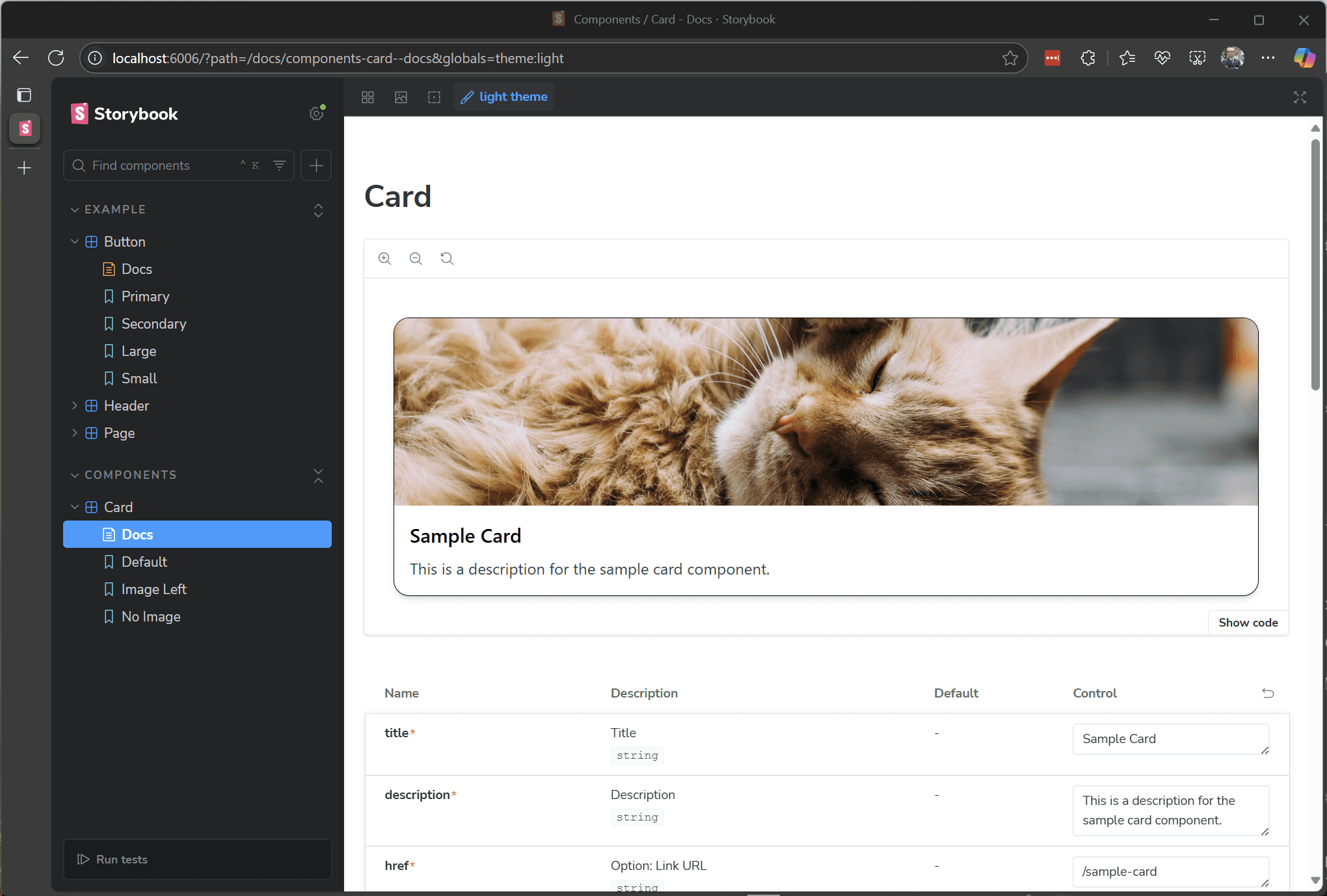
Click on the Switch mode button to switch to dark mode.
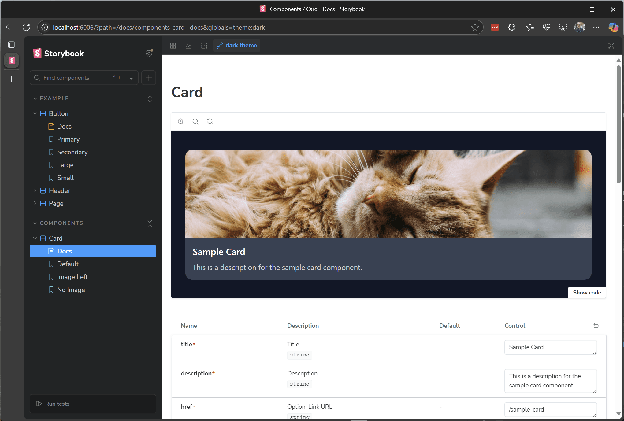
The colours are set in dark mode in the intended way.Next, when checking the operation when the image is positioned on the left side, the display when on the left side was also confirmed in the following form.
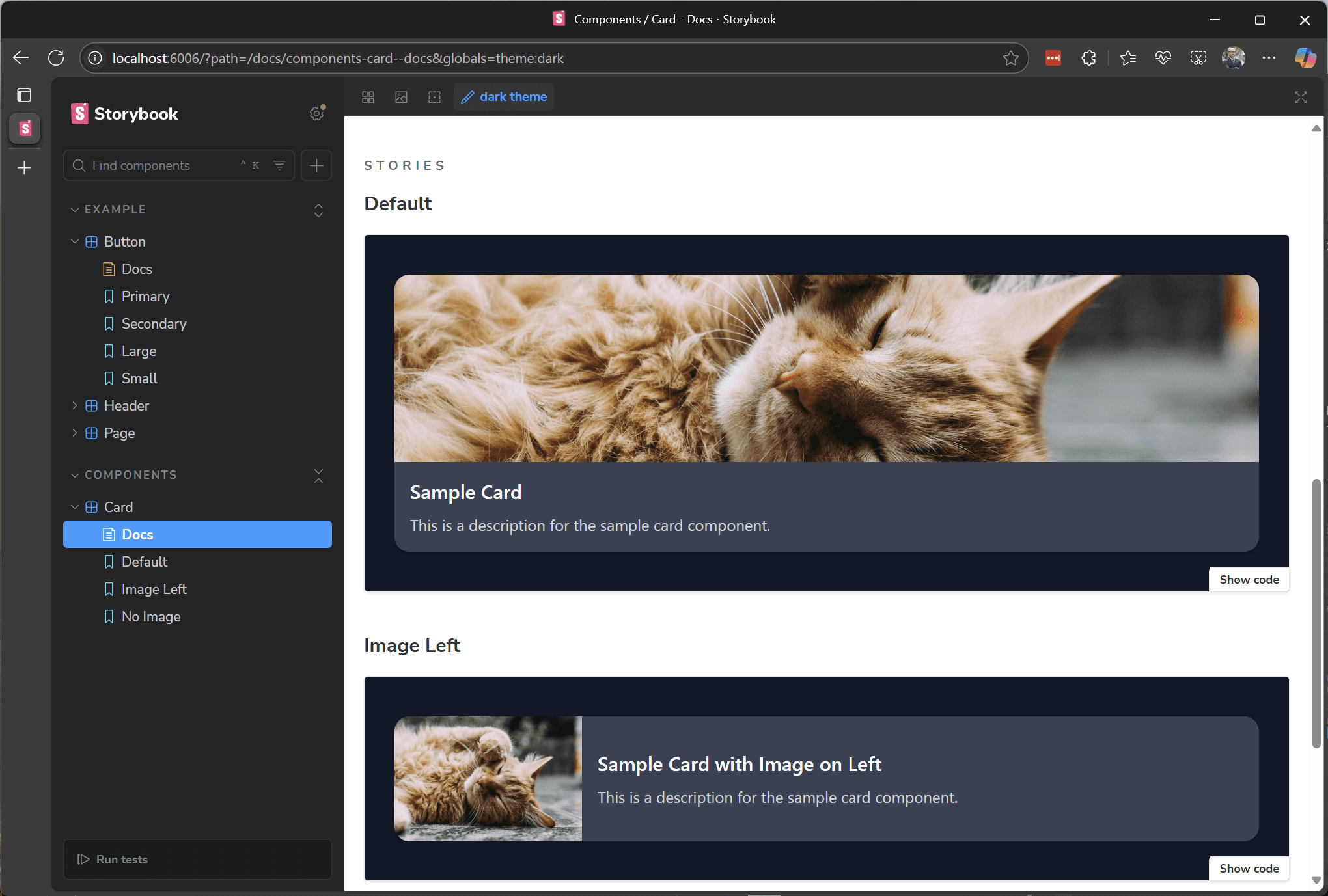
Now you can test the operation in dark mode and on the display.
Deployment in Vercel
The Storybook data created this time will be deployed in Vercel so that it can be referenced on the site at any time.
- Open New Project in Vercel
- Specify the relevant repository.
- Select Storybook for the Framework Preset
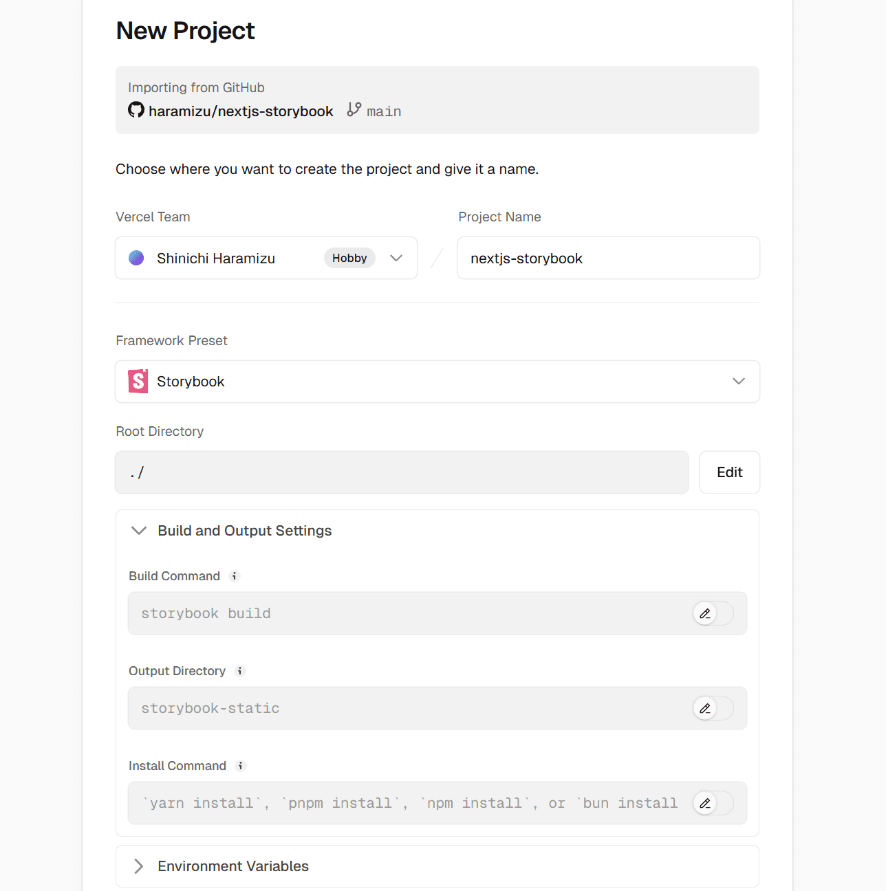
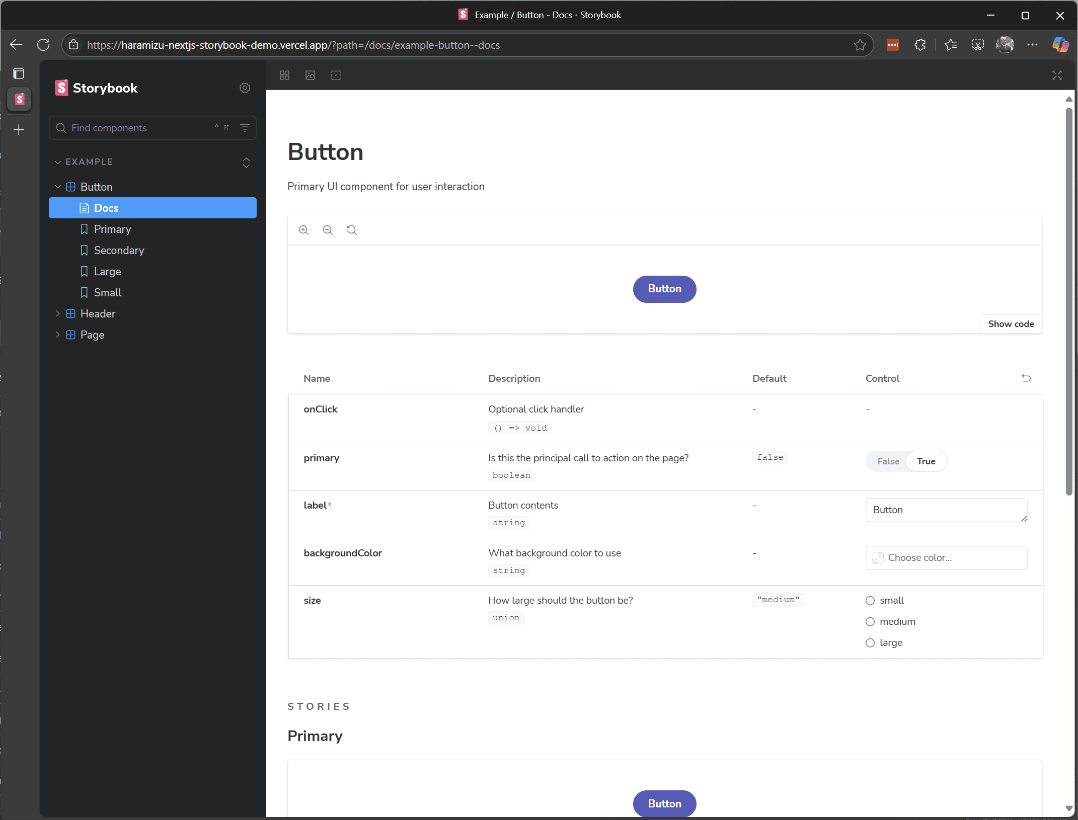
There are no environment variables, so deployment can be done without additional configuration.After a short time, you can now refer to the following.
Summary
In this case, we proceeded to install Storybook against the Next.js App Router and share the Tailwind CSS.The sample code we implemented this time can be found in the following repositories and on the demo site.
- GitHub Repository - https://github.com/haramizu/nextjs-storybook
- Demo site - https://haramizu-nextjs-storybook-demo.vercel.app/