In this document, we will evaluate the UI component library shadcn/ui, which has been gaining attention recently. shadcn/ui offers a wide range of customizable components and is not provided as an npm package, making it easy to use.
Next.js + Tailwind CSS + shadcn/ui
2024-12-02
The main benefits are as follows:
- Increased development speed: Utilizing existing components can shorten UI development time.
- Consistent design: Following unified design guidelines ensures consistency across the entire application.
- Ease of maintenance: The component-based architecture enhances code reusability and simplifies maintenance.
In this document, we will evaluate its use as a Pages Router based on a Next.js project.
Create a Project
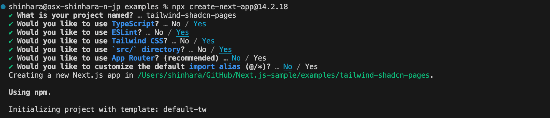
First, let’s create a Next.js project. Refer to the following page for the steps.
Let’s create the project right away.
- Create a new Next.js project.
- Next.js: 14.2.18
- TypeScript: Yes
- Tailwind CSS: Yes
- App Router: No
- Initialize for using shadcn
sh
- During initialization, the following questions will be displayed. We will mostly answer with the default options.
- Style: New York
- base color: Neutral
- CSS variables: yes
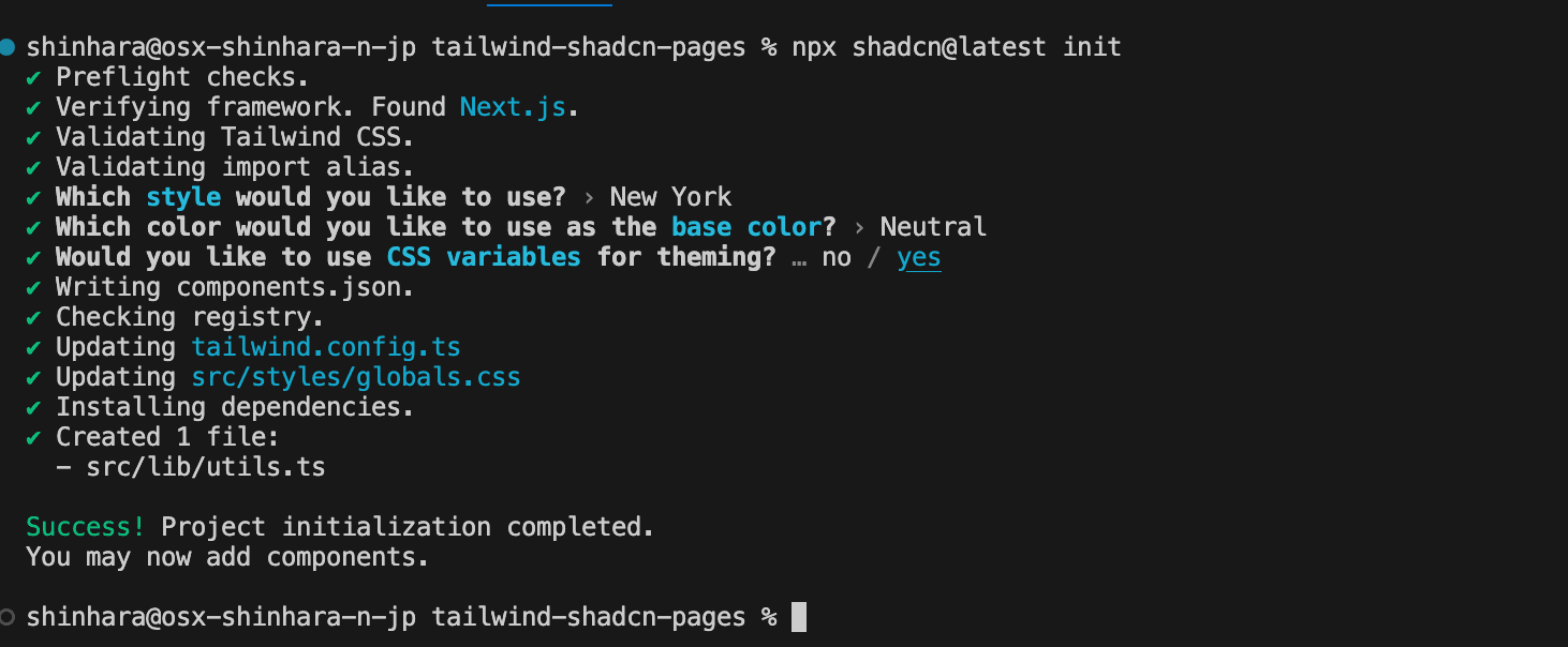
Check the files that have changed after initialization.
- New files components.json and src/lib/utils.ts added
- Multiple new packages added to package.json
package.json
- Update tailwind.config.ts
- Add Darkmode
- Update Colors
- Add plugin (tailwindcss-animate)
- Update globals.css
Now we are ready.
Add Components
Let’s add some components right away.
Button
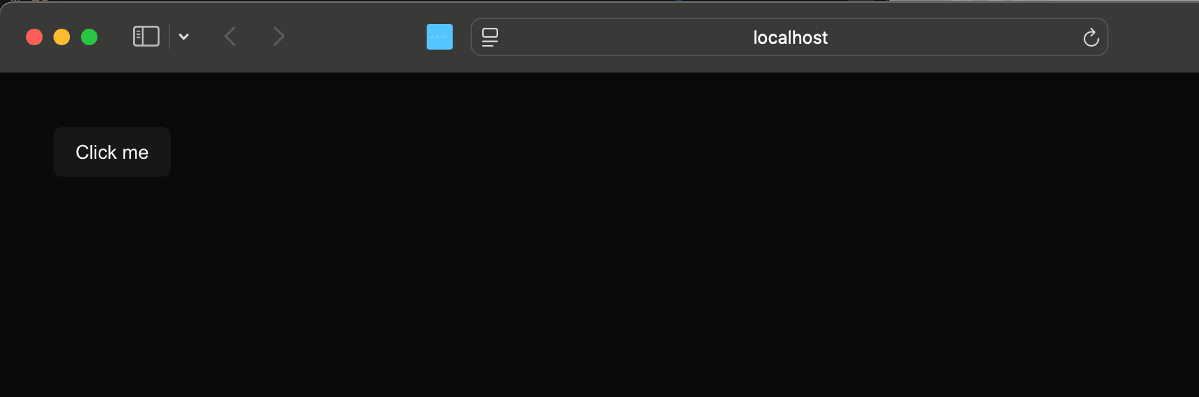
Add the button as described in the installation steps.
sh
Check the project updates as follows.
- Component file src/components/ui/button.tsx added
- Package @radix-ui/react-slot added
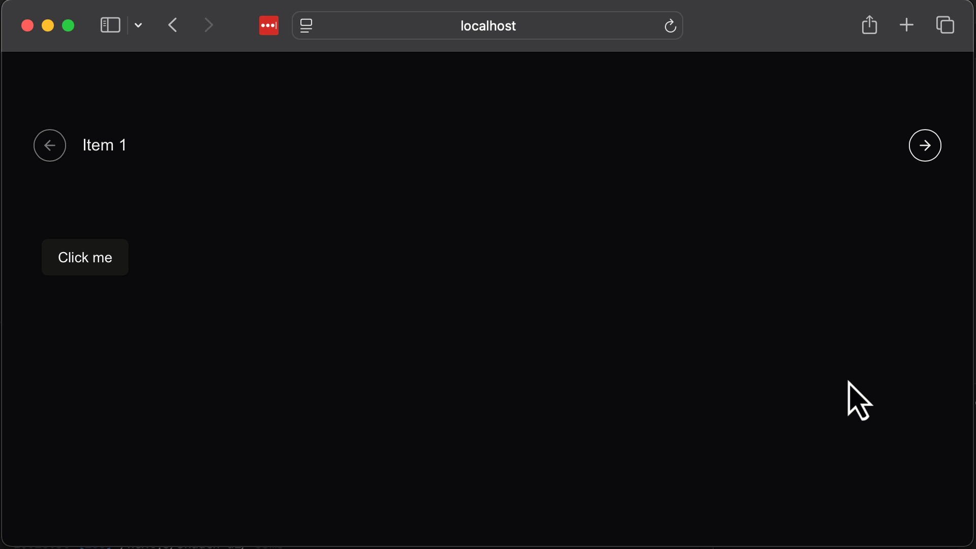
The component is now available. We updated the top page as follows.
src/pages/index.tsx
The button is now displayed.
For more detailed usage of the Button, refer to the following page.
Carousel
Next, let’s add a Carousel, which is often used for practice when creating websites.
sh
A question will be displayed asking if you want to overwrite button.tsx.
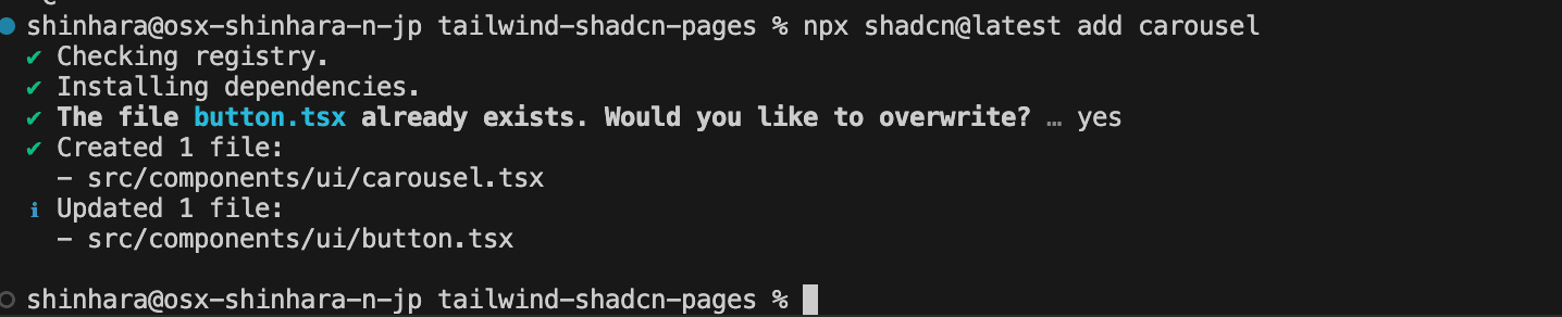
Select overwrite, and the project update will be completed. Check the changes as follows.
- Component file src/components/ui/carousel.tsx added
- Package embla-carousel-react added
shadcn/ui’s Carousel uses embla-carousel-react. The official site of this package is as follows.
Place the created component on the top page as before.
src/pages/index.tsx
The actual operation is as follows.
For more detailed usage of the Carousel, refer to the following page.
Summary
This time, we introduced only Button and Carousel, but various UIs are available, making it easier to use components for your site.
The Next.js project introduced here is published in the following repository.