Last time, we progressed to retrieving the blog title on the Next.js homepage. This time, we'll set up the environment by adding libraries and other tools we have on hand as we build the blog.
Add Icon Library
This time, we will be using Lucide React for the icons on the site.
Please execute the following command.
There are also various other libraries available. Feel free to use them according to your preferences.
Install Storybook
We will enable the use of Storybook, a convenient tool for component management, in this project. The procedure will be carried out by referring to the following page.
When referring to previous articles, note that while there were errors in the postcss.config.mjs configuration at the time, these have been resolved with updates to Next.js (I've also added the same note to the previous articles).
Setup Storybook
At the root of your Next.js project, run the following command:
Once installation is complete, Storybook will launch automatically. To launch it in future sessions, use the following command:
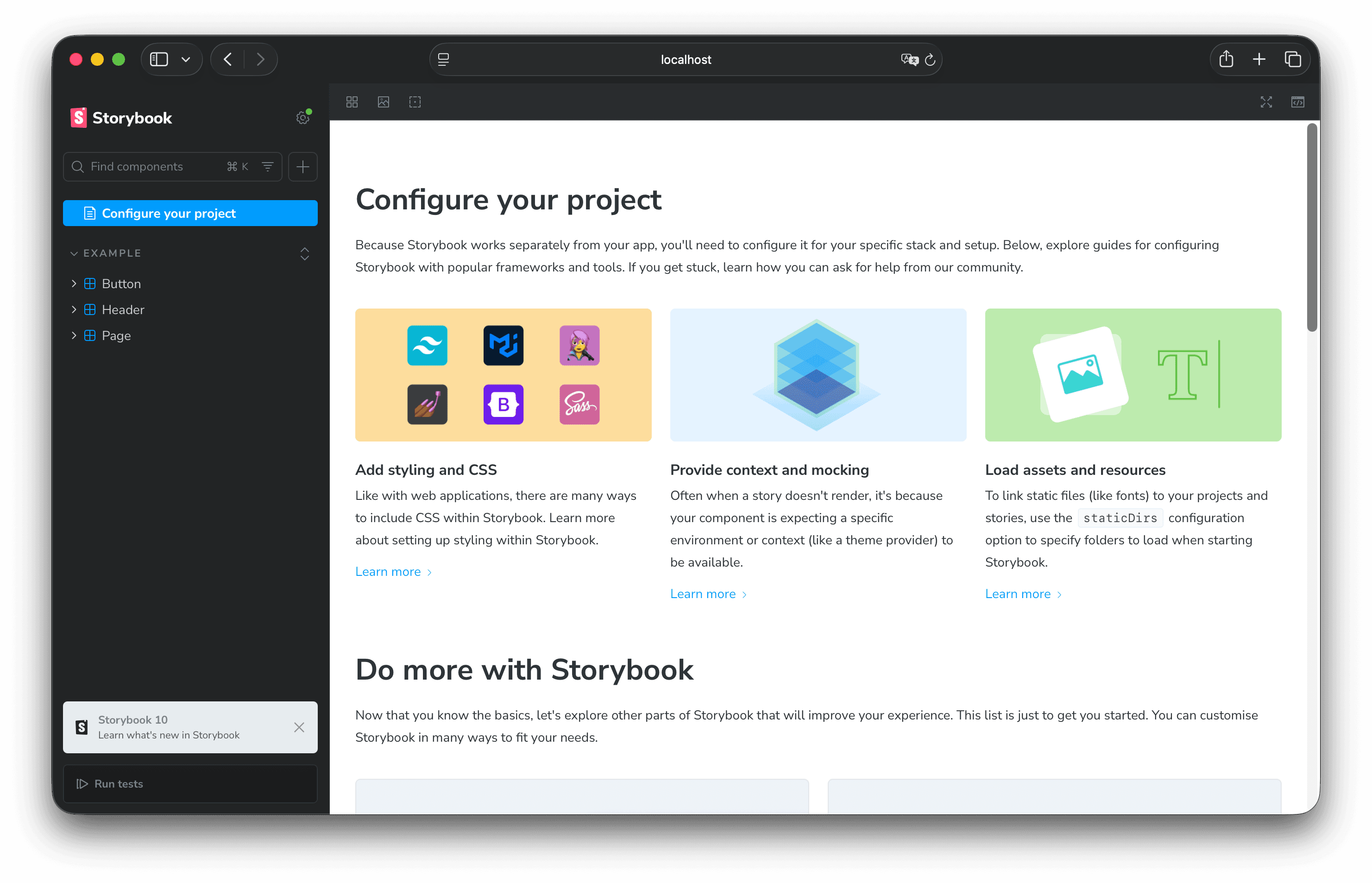
It now starts up.

Changes to Tailwind CSS files
The Tailwind CSS file used in Next.js is currently located at `apps/nextjs/app/globals.css`. Move it to `apps/nextjs/styles/globals.css`.
- globals.css — old place
- globals.css — new place
Modify the code in Next.js that references this file.
Also, make sure the preview.ts file in Storybook references the same file as above.
Organize components and CSS
Next, delete the files provided as samples by Storybook and place the sample components.
First, change the folder name of the components included as Storybook samples from `apps/nextjs/stories` to `apps/nextjs/components`. Additionally, create a `storybook` folder to manage `stories.ts` files collectively.
Since the component reference location has changed, please update the paths referenced in the following files.
Next, we'll place the sample files. Please use the following code as the component file.
Next, create the stories file.
Finally, we'll adjust the stylesheet. Add one stylesheet file.
Apply the styles from the above file to globals.css. Remove other code and make it as follows.
This time, we'll add sample images to the public directory. Since the image file paths are specified in `apps/nextjs/storybook/Hero.stories.ts`, please change the image paths if you upload any files.
Check Functionality
We will proceed to verify how the above changes are applied.
Test about Storybook
First, verify operation in Storybook. Please execute the following command.
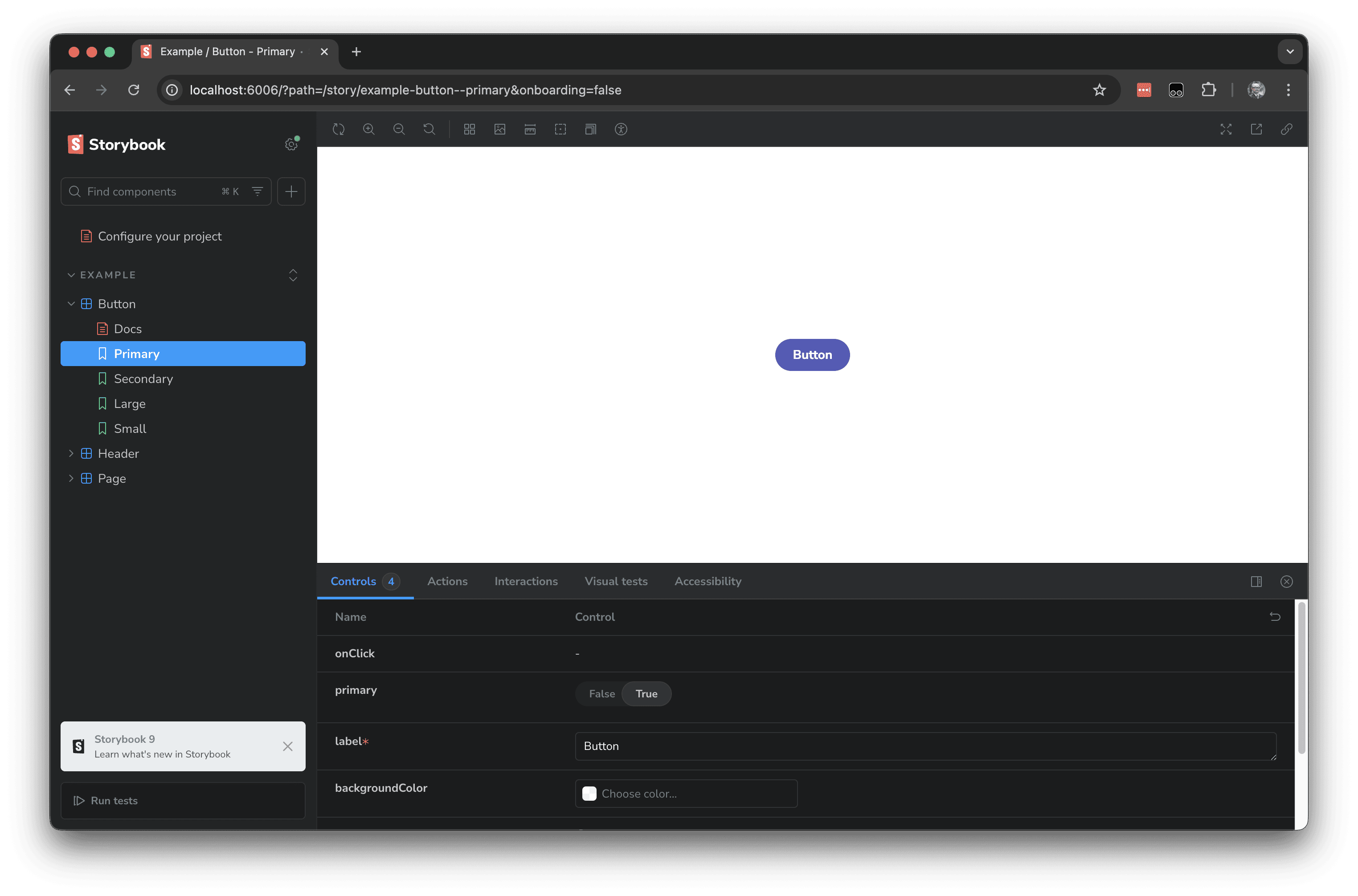
The Hero component is displayed as a sample as follows.

Test about Next.js
Next, we'll test it in Next.js. Since we haven't added this component yet, we'll add the Hero to the top page.
First, load the component.
Next, to use this component, add the Hero section to the same file.
Everything is now ready. Launch the Next.js component.
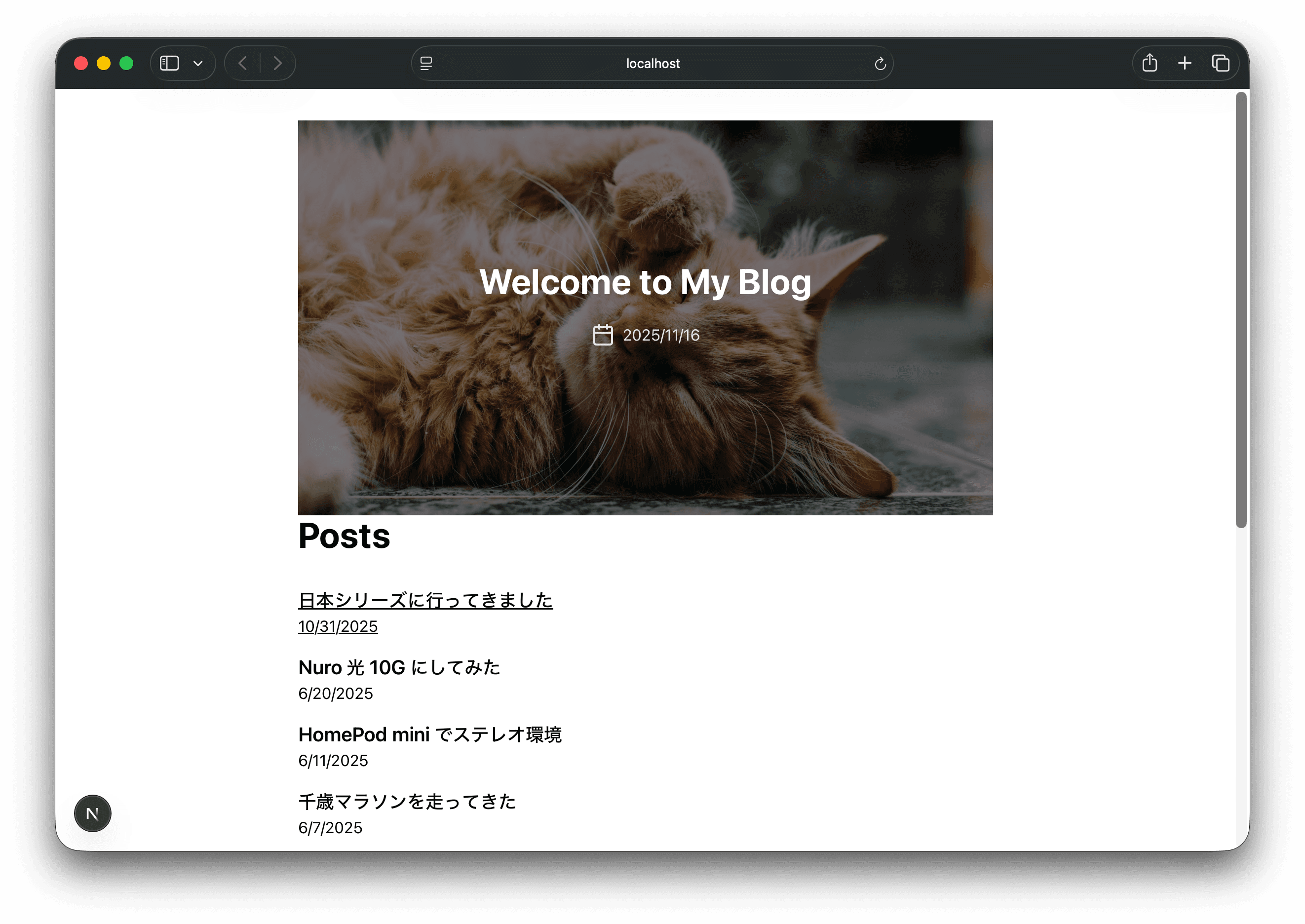
As shown below, we were able to utilize the component.

Summary
As I begin building this blog, I added Storybook right away since it'll be handy for managing components. I also added the icon library for the site at the start and am already using it as icons in the Hero section.
The code up to this point is published on the following branch.
