The Tailwind Starter, which serves as the base for the sample created on this document site, applies Tailwind CSS as the stylesheet framework based on the Next.js Starter. This document introduces the work done on the base Next.js Starter.
Tailwind CSS Starter
2025-01-23
The base of the template was created as follows:
Creating the Site
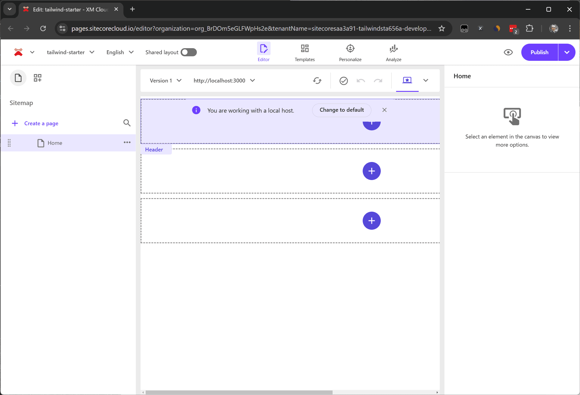
First, launch XM Cloud in a SaaS environment based on the above template.
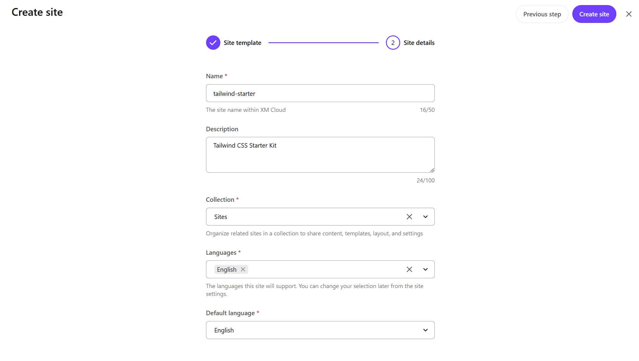
- Select Empty as the template for the site to be created.
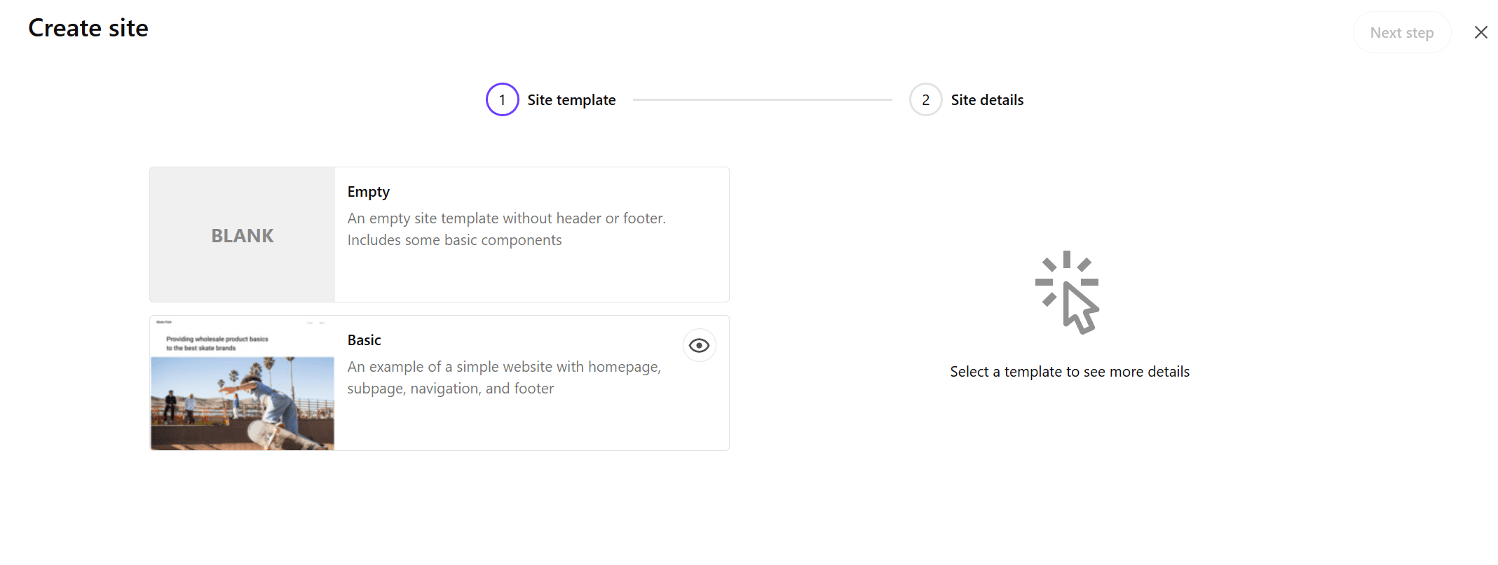
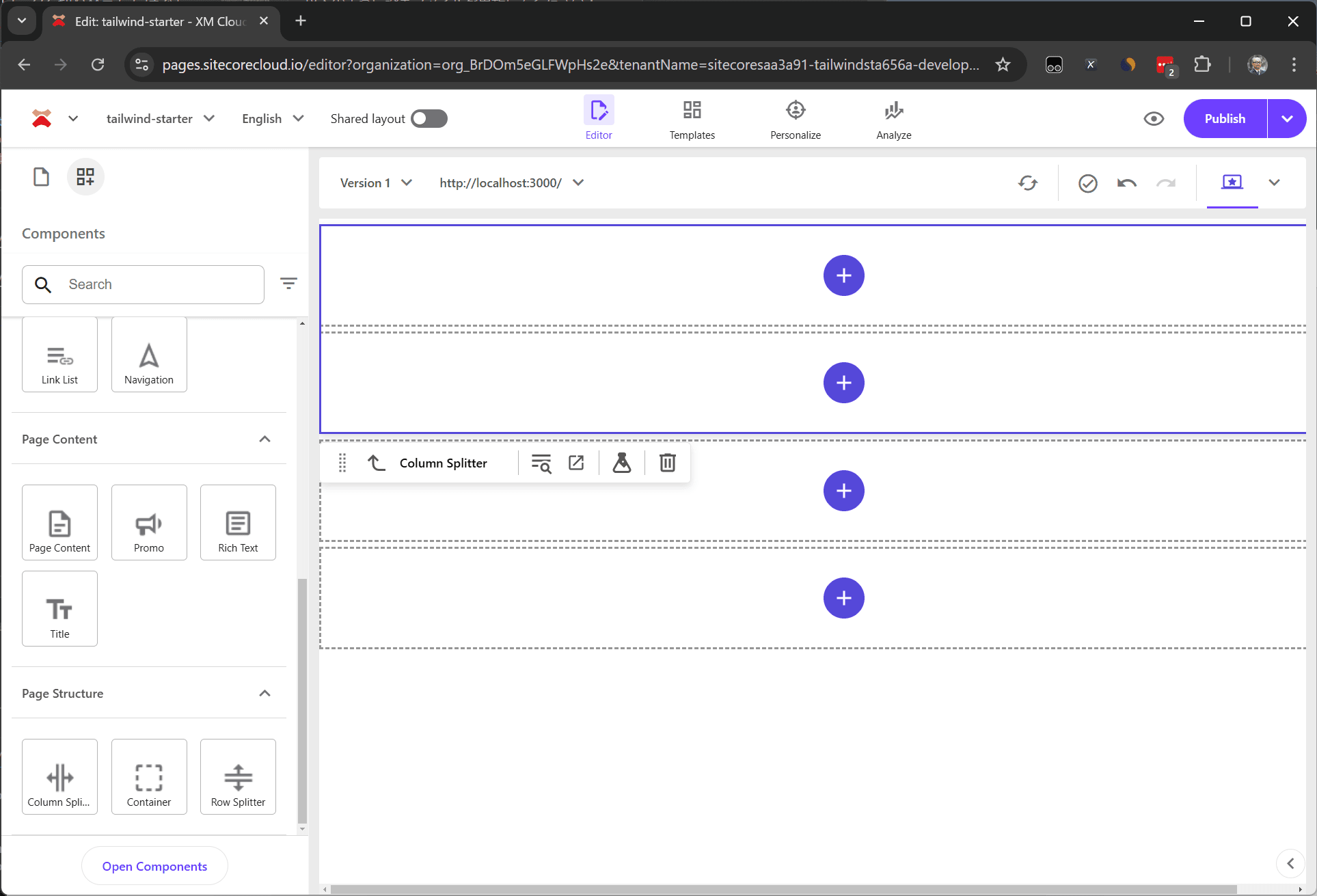
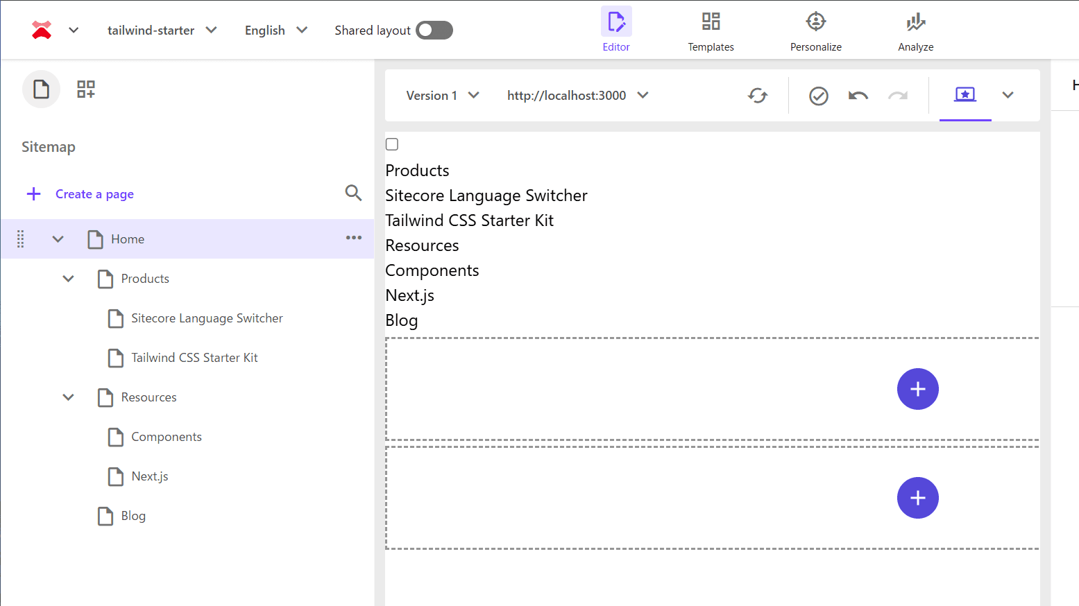
- Create the site as shown below and prepare the site to be worked on in the XM Cloud development environment.
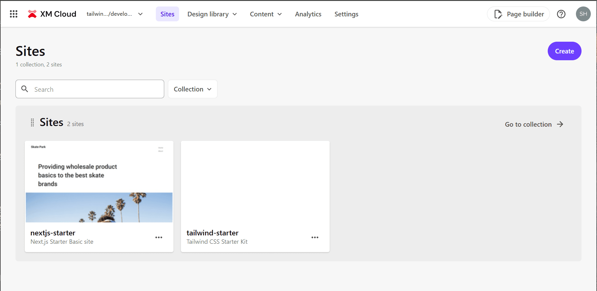
- Work will proceed with the Next.js Starter Kit’s Basic site and the site created above side by side.
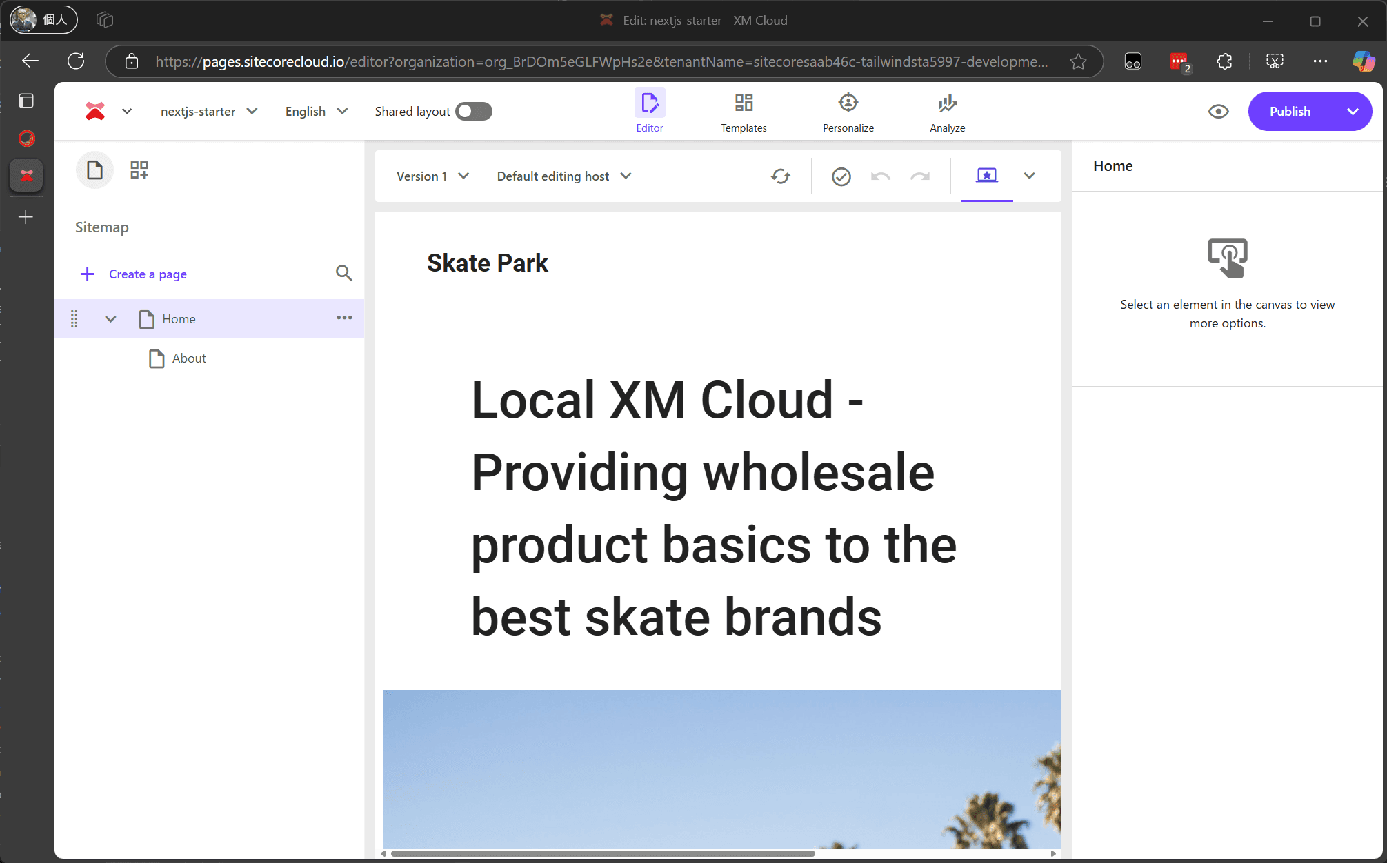
- In Pages, link with the local Next.js instance to check the page display using the development code.
- Since Empty is selected this time, nothing is displayed as shown below.
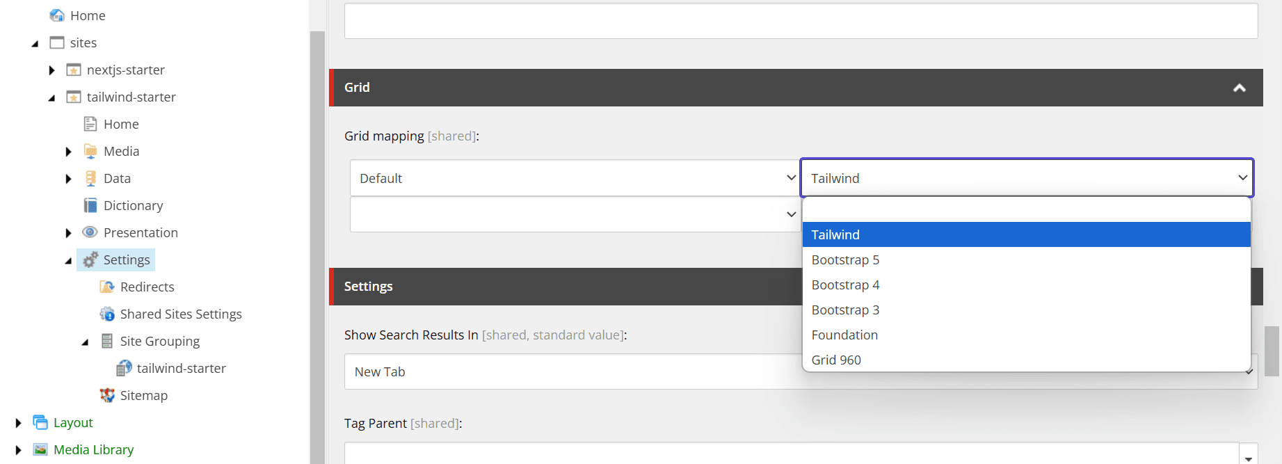
- Open the Content Editor, select the item /sitecore/content/sites/tailwind-starter/Settings as the JSS setting, and change the Grid setting to Tailwind.
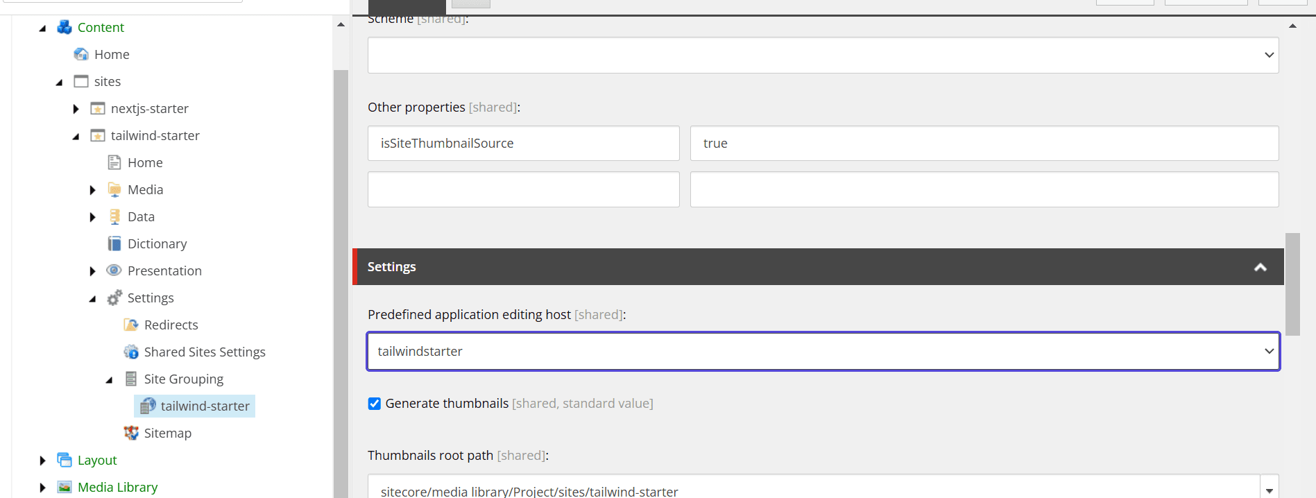
- Next, open the site setting /sitecore/content/sites/tailwind-starter/Settings/Site Grouping/tailwind-starter and change the Predefined application editing host to tailwindstarter.
The environment for development is now ready.
Applying Tailwind CSS
Since the Next.js Starter Kit uses Bootstrap as the CSS framework, Tailwind CSS will be applied while removing unnecessary bootstrap packages.
Installing Tailwind CSS
First, rewrite to enable the use of Tailwind CSS.
- First, install Tailwind CSS.
sh
- Copy the src/assets/app.css file and create src/styles/app.css.
- Create the src/styles/globals.css file and set the following styles.
src/styles/globals.css
- Modify the code in src/pages/_app.tsx to load the stylesheet as follows.
src/pages/_app.tsx
- Create the postcss.config.mjs file and add the following code.
postcss.config.mjs
- To enable the use of @/ when loading the stylesheet, add the following lines to the Typescript configuration tsconfig.json.
tsconfig.json
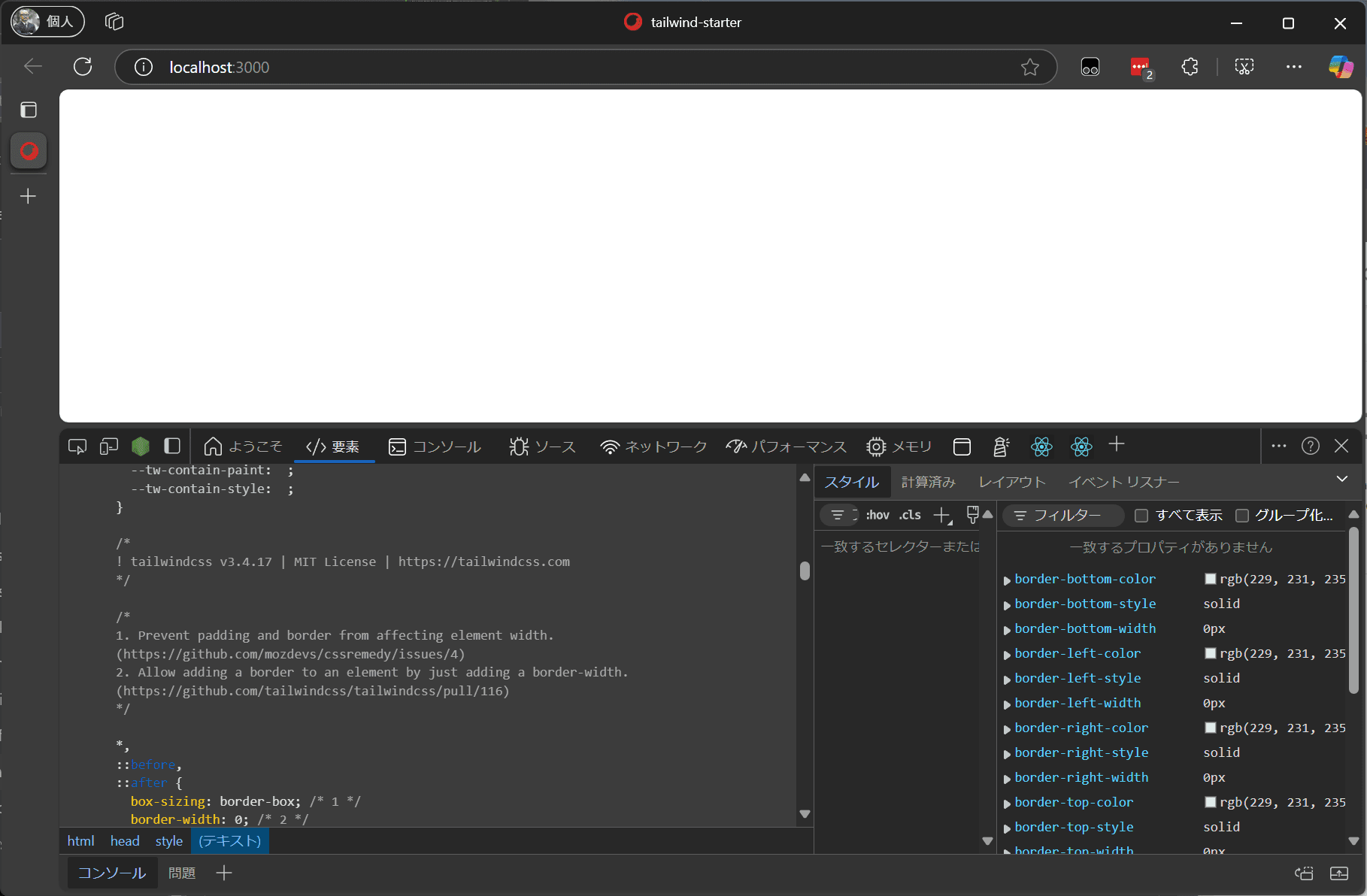
Now Tailwind CSS is applied. You can confirm that the stylesheet is applied by accessing it with npm run start:connected and checking with developer tools since there is no content yet.
Removing Bootstrap
Next, remove the Bootstrap-related files that will no longer be used.
- Delete the folder
src/assetswhere the stylesheet-related files are located. - Uninstall the bootstrap and font-awesome packages.
sh
This removes the bootstrap-related files.
Adjusting Stylesheets
The above work only switches the stylesheet framework, and no styles are defined for each component. Therefore, add styles for some components.
Grid
Two frequently used components are Column Splitter and Row Splitter. When placing the Column Splitter, it looks like this.
The expected result is to be arranged horizontally, but it is arranged vertically. The HTML output is as follows.
tsx
To arrange them horizontally, add the flex class. Create a file src/styles/components/ColumnSplitter.css and apply the following code.
src/styles/components/ColumnSplitter.css
As a result, the display changes as follows.
They are arranged horizontally, but the width specified by basis-1/2 is not applied. Tailwind CSS disables styles not specified in the code to keep the stylesheet simple, so the styles output by the component are not applied.
Therefore, add the following code to the configuration file tailwind.config.js to enable the use of salelist.
tailwind.config.js
Successfully, they are arranged horizontally with the 1/2 width applied.
Display Options
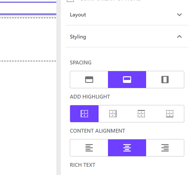
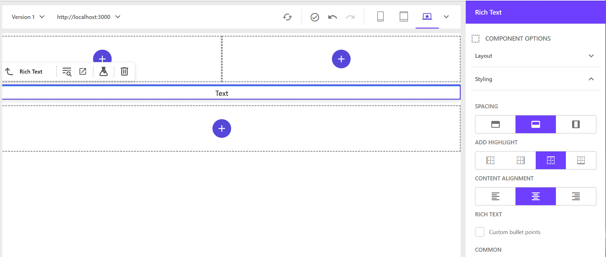
This time, use the RichText editor to add styles for the component’s display position and text position. First, place the RichText component using Pages.
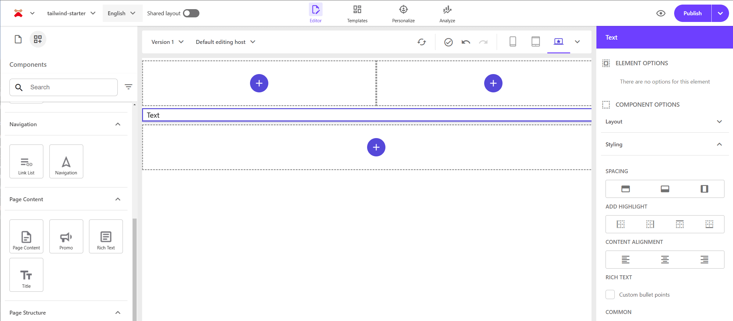
When placed, the component options display Spacing / Add Highlight / Content Alignment / Rich Text settings. Rich Text will be covered separately, but for example, set the items as follows.
When set, the HTML code changes as follows.
tsx
These definitions are defined as items within the site being built. Refer to the site’s tree as follows. The values listed on the right side of the items are the values output to the CSS.
Spacing and Content alignment are general display options that can also be used for images. Create two files for common styles.
src\styles\common\alignment.css
src\styles\common\highlight.css
src\styles\common\spacing.css
Add the above three files to the globals.css file.
src\styles\globals.css
This reflects the display position as follows.
Rich Text
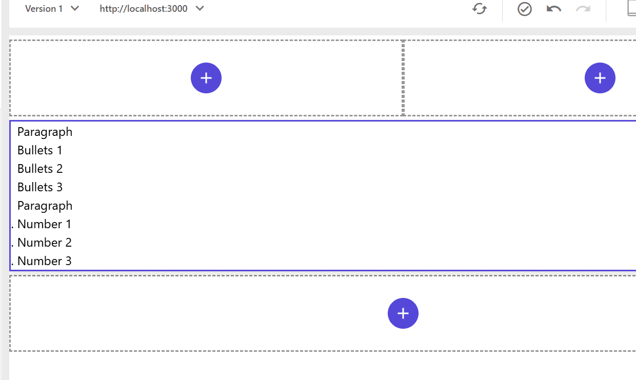
For the HTML inside the RichText component, let’s start by setting up paragraphs as follows:
html
When using Tailwind CSS, if nothing is defined, it will be displayed flat as shown below.
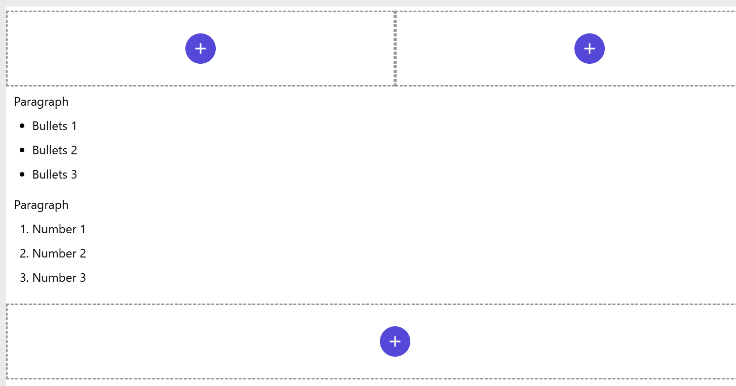
We need to add definitions for the display in RichText. This also needs to be applied to tags like h1, so let’s create a file to define the styles for RichText as follows:
src\styles\components\RichText.css
After importing the above styles in the src/styles/globals.css file, you can preview the changes and see that the display has been updated.
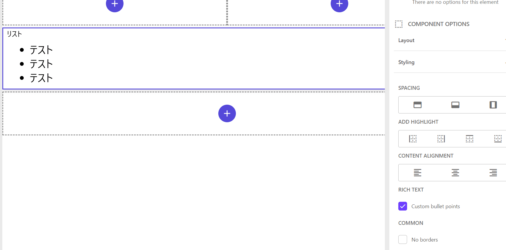
There are also sample values prepared to display styles for Rich Text.
To enable this and change the list display, add the following code to src/styles/components/RichText.css:
css
After setting this, checking the display options for the RichText component will enlarge the list text.
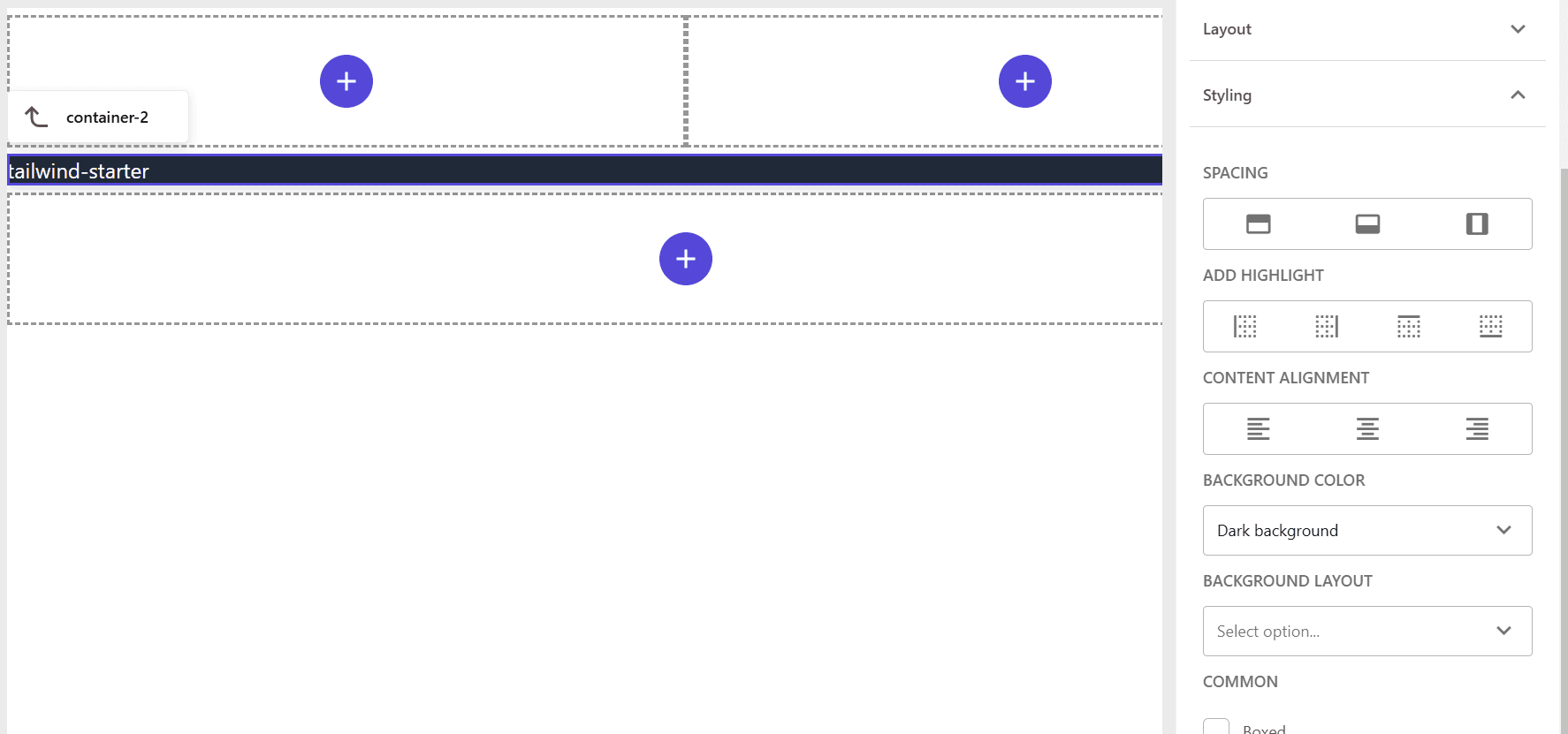
Container Background Color
Containers can hold various components and can be very useful for controlling display and responsiveness at the container level. The styles prepared specifically for containers are as follows:
To define only the background color part, add the following stylesheet:
src\styles\components\Container.css
Add the above file to src/styles/globals.css to enable the container background colors. Below is the result of placing a container and specifying the background color.
LinkList
To check the display of the standard list component, first create sample items and place them in Pages, which will be displayed as follows:
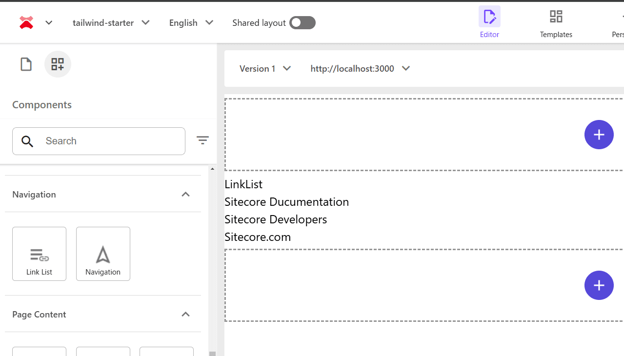
The actual HTML output is as follows:
html
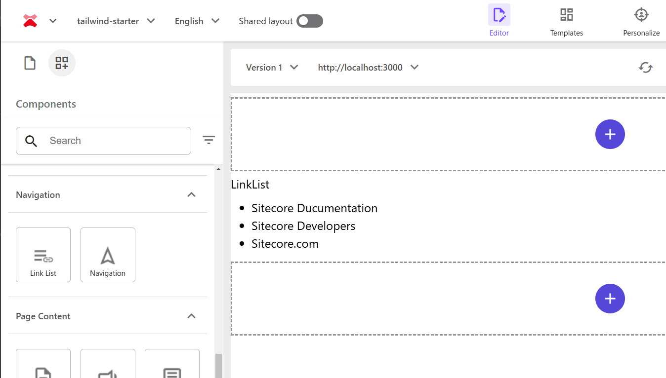
For the above HTML, you can use the list styles from RichText. Therefore, add the following file:
src\styles\components\LinkList.css
Add the above file to src/styles/globals.css to display the link list as shown below.
Navigation
The Navigation component has several styles prepared, and explaining all of them would be lengthy, so let’s adjust one navigation style for now. First, create sample items and arrange them hierarchically in the site pages as follows:
Using the above content tree, place the Navigation component, which will be displayed as follows. When using Tailwind CSS, it is initially displayed flat.
The actual HTML output is as follows:
html
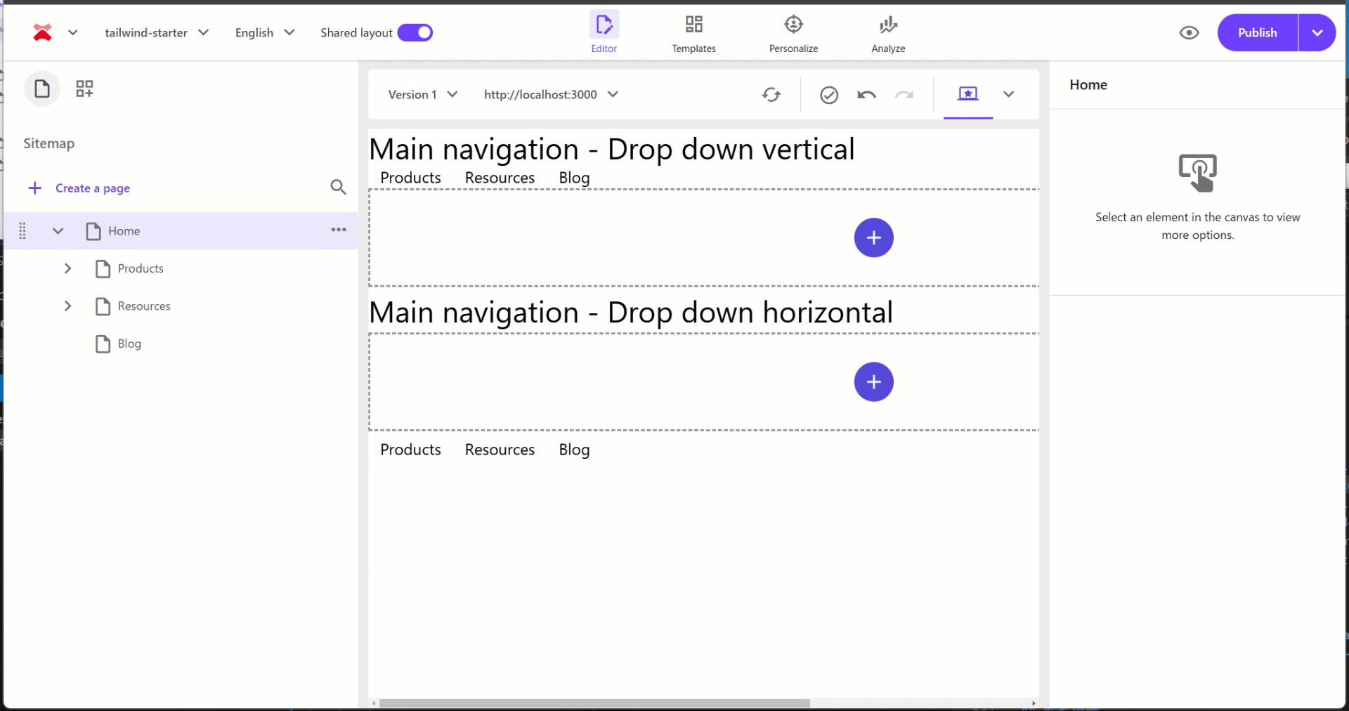
The styles added to the display options for the menu are defined in the site’s styles as follows. This time, let’s enable Main navigation - Drop down vertical and Main navigation - Drop down horizontal, and leave the mobile implementation for later.
The actual stylesheet will adjust the top-level display with navigation-main, display the menu vertically with navigation-main-vertical, and display the submenu horizontally with navigation-main-horizontal. Below is the completed code:
src\styles\components\Navigation.css
Below is a video showing the two menus placed and their respective behaviors.
Summary
This time, we introduced the initial steps for using Tailwind CSS stylesheets based on the Next.js Starter Kit provided by Sitecore. By following this walkthrough, you can learn how to manage stylesheets and how to call and apply site styles when holding styles on the Sitecore side.
References
Update Information
- 2025-01-24 Upgrade to Tailwind CSS 4.0