前回はサンプルのコードを配置して動かすところまで進めていきました。今回は、どういうコードの記述が必要か、データはどういう形で持つのか?などを確認していきたいと思います。
プレゼンテーションを確認する
前回作成をしたサンプルのコンポーネントの動作を確認していきたいと思います。まず、プレゼンテーションの設定を確認すると、BYOC Wrapper のコントロールが配置されています。
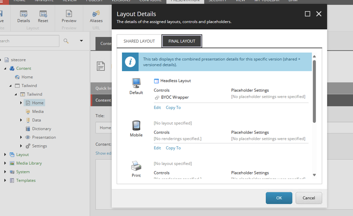
コントロールのデータを見ると、以下のようにプロパティが設定されています。
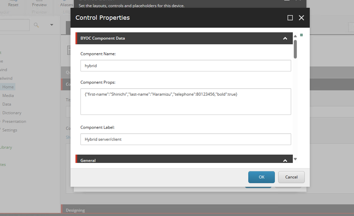
実際に設定をしたデータは、Component Props として保存されていることがわかります。
コードを確認していく
続いてサンプルのコードを確認していきます。まず最初にコンポーネントで記載しているレイアウト部分に関しては、以下のようになります。
export default function ExampleClientsideComponent(props: {
  firstName: string;
  lastName: string;
  telephone: string;
  bold: boolean;
}) {
  return (
    <>
      <h2>Hybrid</h2>
      <dl style={props.bold ? { fontWeight: 'bold' } : {}}>
        <dt>Description</dt>
        <dd>Interactive UI with SEO-friendly fallback</dd>
        <dt>Rendered on</dt>
        <dd>{typeof window != 'undefined' ? 'Clientside' : 'Server'}</dd>
        <dt>Data</dt>
        <dd>
          {props.firstName} {props.lastName} / {props.telephone}
        </dd>
      </dl>
    </>
  );
}
上記のコンポーネントでは、以下の項目を利用してレンダリングしています。
firstName: string;
lastName: string;
telephone: string;
bold: boolean;
続いてこの下で記載されているコードは、コンポーネントに関する定義となっています。
FEAAS.registerComponent(ExampleClientsideComponent, {
  name: 'hybrid',
  title: 'Hybrid server/client',
  description: 'Interactive UI with SEO-friendly fallback',
  thumbnail: 'https://feaasstatic.blob.core.windows.net/assets/thumbnails/byoc.svg',
  group: 'Examples',
  required: ['firstName'],
  properties: {
    firstName: {
      type: 'string',
      title: 'First name',
    },
    lastName: {
      type: 'string',
      title: 'Last name',
    },
    telephone: {
      type: 'number',
      title: 'Telephone',
      minLength: 10,
    },
    bold: {
      type: 'boolean',
      title: 'Show text in bold weight',
    },
  },
  ui: {
    firstName: {
      'ui:autofocus': true,
      'ui:emptyValue': '',
      'ui:placeholder': 'Write your first name',
    },
    bold: {
      'ui:widget': 'radio',
    },
  },
});
この部分でコンポーネントに関しての定義が入っています。
name - コンポーネントの名称
title - Pages で表示されるコンポーネント名
group - Pages でコンポーネントを表示するグループ名
thumbnail - Pages で表示するコンポーネントのサムネイル画像
required - 必須項目
properties - コンポーネントで持つデータに関して
それでは一気に、以下のようにコードを書き換えました。利用しているのはテキスト、それに合わせた画像の情報となります。
import * as FEAAS from '@sitecore-feaas/clientside/react';

export default function ByoCSample(props: {
  simpleText: string;
  imageUrl: string;
  imageText: string;
}) {
  return (
    <>
      <h2>ByoC Sample</h2>
      <dl>
        <dt>Rendered on</dt>
        <dd>{typeof window != 'undefined' ? 'Clientside' : 'Server'}</dd>
        <dt>Data</dt>
        <dd>
          {props.simpleText} {props.imageUrl} / {props.imageText}
        </dd>
      </dl>
    </>
  );
}

FEAAS.registerComponent(ByoCSample, {
  name: 'BYOCsample',
  title: 'BYOC Sample',
  description: 'Interactive UI with SEO-friendly fallback',
  thumbnail: 'https://feaasstatic.blob.core.windows.net/assets/thumbnails/byoc.svg',
  group: 'Tailwind Sample',
  required: ['simpleText'],
  properties: {
    simpleText: {
      type: 'string',
      title: 'Component Text',
    },
    imageUrl: {
      type: 'string',
      title: 'Image URL',
    },
    imageText: {
      type: 'string',
      title: 'Alt Text',
    },
  },
  ui: {
    simpleText: {
      'ui:autofocus': true,
      'ui:emptyValue': '',
      'ui:placeholder': 'simple name',
    },
  },
});
項目を変更しただけですが、今回はこれで動かしたいと思います。実際に配置すると以下のように表示されます。
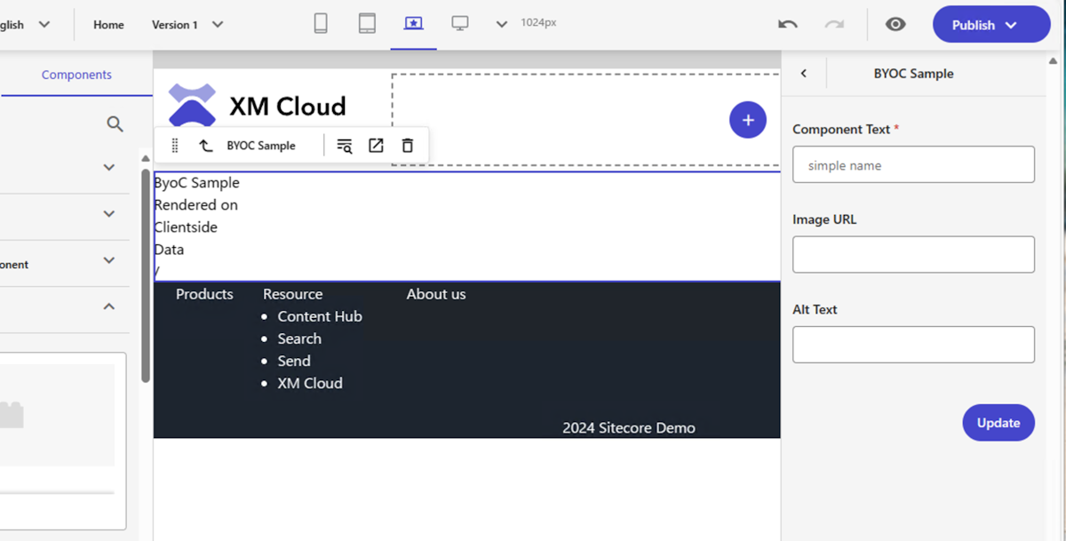
Pages でコンポーネントの配置、そしてその要素を変更できることを確認することができました。
プレーンなコンポーネントを生成する
今回はサンプルのコードを利用して作成をしましたが、コマンドでコンポーネントのソースコードを出力することが可能です。
powershell jss scaffold Sample --byoc
上記のコマンドを実行すると、src\components\Sample.tsx のファイルが生成されます。コードは以下の通りです。
typescript import React from 'react'; import * as FEAAS from '@sitecore-feaas/clientside/react';
interface SampleProps { title: string; columnsCount: number; }
export const Sample = (props: SampleProps): JSX.Element => { const columns: string[] = []; for (let i = 0; i < props.columnsCount; i++) { columns.push(`Component Column ${i + 1}`); } return ( <div className="container"> <h2>{props.title || 'BYOC Demo'}</h2> <p>Sample Component</p> <div className="row"> {columns.map((text, index) => ( <div key={index} className={`col-sm-${props.columnsCount}`}> {text} </div> ))} </div> </div> ); };
FEAAS.External.registerComponent(Sample, { name: 'Sample', properties: { title: { type: 'string', }, columnsCount: { type: 'number', }, }, });
このコードを元に、コンポーネントを作って登録する形になるかと思います。
まとめ
今回は Bring own your component という仕組みで Sitecore にコンポーネントを追加しました。みたまま編集はできませんが、とはいえコンポーネントの中身を書き換えることができるコンポーネントを簡単に作ることができます。Figma などから出力したコードなどを利用する際に便利な機能になります。